SHARE THIS
Have you ever wondered what it’s like when architects build their own homes? Well, now’s your chance to find out – Tom and I have bought a fixer-upper in Roncesvalles! Last week, we closed the deal on a small detached brick box in Toronto’s Roncesvalles neighbourhood. As green home designers we’re going to renovate it from top to bottom and make it as energy efficient and sustainable as we can possibly afford. Promoting energy-efficient design is something we do all day, every day, and yet our current apartment is leaky and uncomfortable. Now we have the chance to join our rank of fabulous clients who live in Solares houses! On this blog, I’ll be telling the story of our progress as we immerse ourselves in the same process through which we lead our clients. We’ll experience what they experience, including all the visioning homework, decision-making, spending and anticipation. For us, this is a chance to put our money where our mouths are and build ourselves a beautiful, environmentally integrated home that meets our needs and budget. I’ll be blogging here from the early stages of the design process, through the challenges of permitting and the ups and down of construction, until the exhilarating moment of moving in. I’ll explain how we make our decisions – particularly around sustainable house design, products and practices – and how we balance our strong sustainability principles with the inevitable reality of affordability. It’s going to be interesting, folks. We’re going to find out what it’s really like to build your own custom home, to work with an architect (ourselves!), and to spend huge amounts of money. We’ve seen it from the other side countless times. Now it’s our turn, and we can’t wait to share our journey with you! - ChristineWe’re building our own home!Go To Project Page

The House
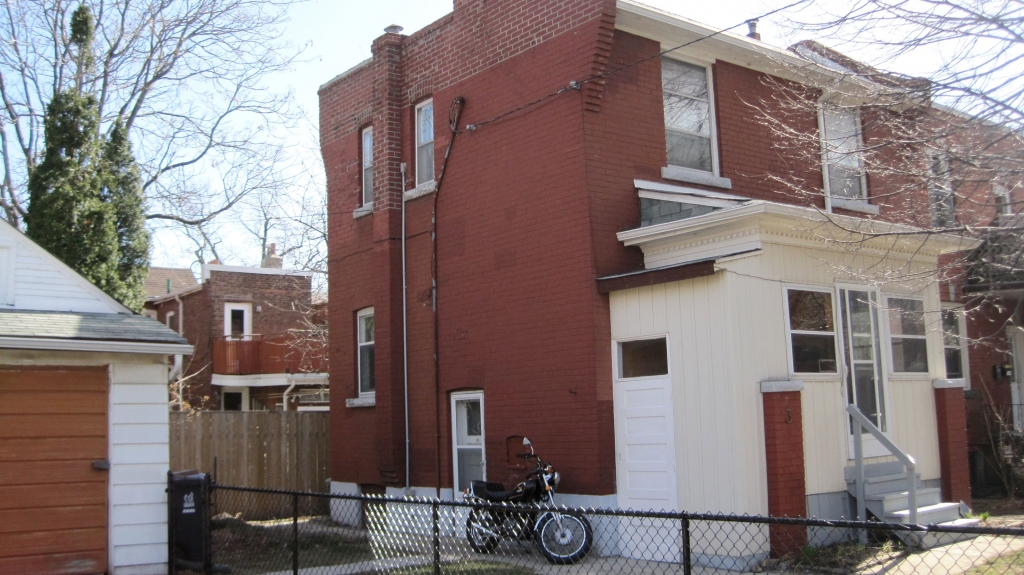
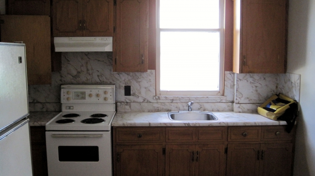
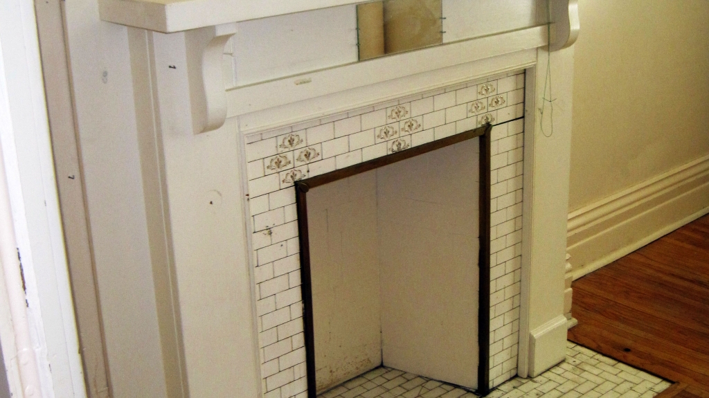
We now have ourselves a detached solid brick house on a square lot along a quiet, leafy street. It’s very close to family, schools and parks, and just a 15 minute walk from our office! We’ll be drawing on our decade of sustainable house design experience as we do this – our own – major renovation and landscaping project.
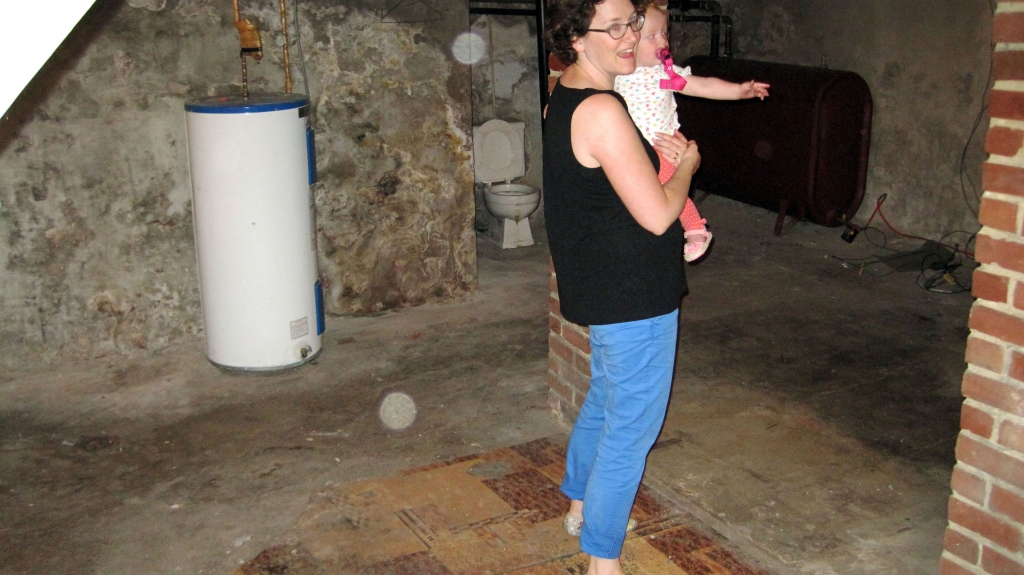
The house has two floors, an unfinished basement, and an enclosed front porch. The building needs A LOT of work, so this will be a full gut renovation job and we can’t wait to sink our teeth into it! Our goal for the house is to have both our own 3-bedroom family home and a basement apartment for rental income. We’ll add a separate exterior entrance to the basement, enabling us to create an independent, self-contained apartment.
The site itself is fairly unconventional, with a moderately sized yard that wraps around the front and side of the house. The other two walls of the house sit directly on the property line which means we have no “back” yard in the traditional sense. A neighbourhood laneway borders the side of the detached garage. A short walk away is the amazing Columbus parkette with a brand-new play structure, splash pad and large shade trees.
The Stats
Lot size: 1,685 sq.ft.
Building footprint: 625 sq.ft.
Total floor area for all three levels: 1,875 sq.ft.
Total finished area of our home on the upper two floors: 900 sq.ft.
Total finished area of the lower level rental suite: 400 sq.ft.
The first big task of the Solares process is to do our Client Homework which sets the stage for the design. Through this exercise, each of us explores the way we live now and the values we want to instil in our new home. We’ve read our clients’ Homework exercises countless times – now it’s our chance to make sure the dog doesn’t eat it… Who am I kidding? I love Homework! When we do this with our clients, we ask each member of the family to do the assignment individually in order for us to capture everyone’s ideas and values. Our kids are still too young, so they’re off the hook! Later in the design process we’ll merge the diverse Homework results into one guiding vision so everyone’s thoughts and dreams are included. The first part of the Homework is to gather images we are drawn to, pictures of homes, products and materials that we love. The images above show the products, feel and aesthetic that Tom and I would love to incorporate in our new home design. They show our thoughts around environmental sustainability choices, lifestyle, connection with the outdoors and materiality. The second part of the Homework is to write our vision for an ideal day we would like to have in our new home five years from now. This helps us design a home that can accommodate the little things in life and to support the daily flow of our future visions. It felt daunting at first, but once we let our imaginations flow, it became really fun. I’m going to go out on a limb and share my “Day in the Life” with you! A Day in the Life Today is my 40th birthday. I wake and watch the golden sun slowly creep along the wall of our bedroom. Tom, who has been up since 6am for his daily run, comes in with a cup of tea and the crossword then heads off to shower and shave. I have fifteen blissful minutes alone with my tea, my puzzle and my golden sunshine. Just as Tom comes back into the bedroom my parents call to sing Happy Birthday. The kids hear the phone ring, come running in and jump under the covers on either side of me. I wrap my arms around them and we talk about our current favourite subject: our upcoming trip to Italy, my 40th birthday gift, which Tom and I have been saving for since his 40th birthday three years ago. Downstairs, there is a huge bouquet of flowers sitting on the island, a yearly treat from Tom. He makes breakfast while the kids and I read books on the sofa. The sun coming in the window feels hot on our backs. Outside the lilac bush is in full bloom. After breakfast Tom takes the kids to soccer practice and I spend an hour pottering around the house: tidying, showering then getting dressed. Julia and Sarah and I meet up lunch on Roncesvalles. We happily snag a table in the shade and treat ourselves with a bottle of chilled prosecco. After lunch I meet up with Tom and the kids and we wander down Roncesvalles buying last minute provisions for tonight’s party. Nick and Julia have agreed to take the kids swimming so we can finish our preparations so we drop them off and wander back home with our shopping bags. Before launching into party set-up mode, we enjoy a quiet cup of tea and the newspaper. We set up food, drinks, music, games and lighting then pop upstairs to change into our party clothes. We have just enough time to wander around the garden looking at the flowers with a cold glass of white wine before we see Nick, Julia, Sarah, Peter and all the kids coming up the road. Soon the entire house and yard is full of friends, family and neighbours chatting, laughing, eating and drinking. Kids run wild and Tom is pulling pizza after pizza out of the oven. Just after the sun sets, Julia comes out of the house with a huge birthday cake ablaze with candles and everyone erupts into song. After the last cake crumbs have been eaten and all the guests leave, we tuck the kids into bed upstairs, gather around the dining table with our closest friends and talk, talk, talk late into the night. – ChristineDesigning Our HouseGo To Project Page
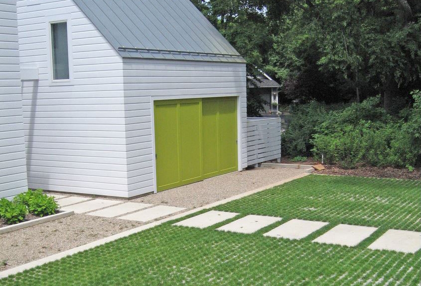
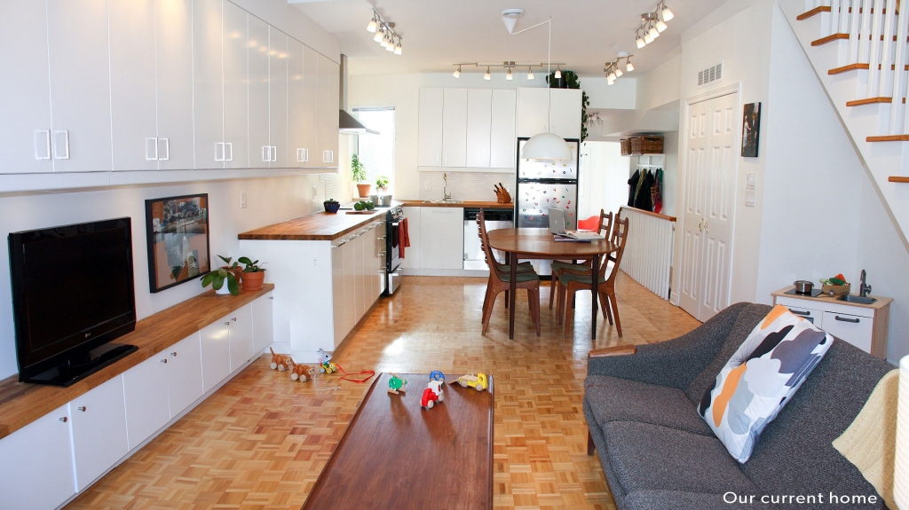
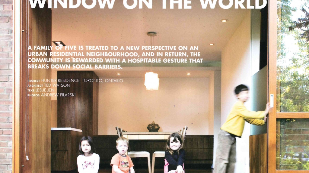
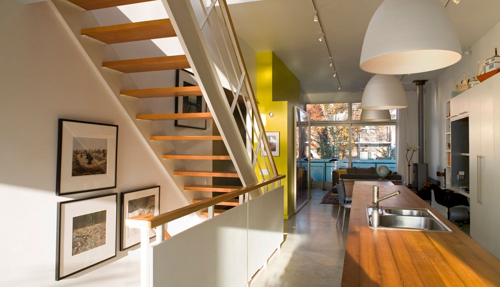
The Floor Plans
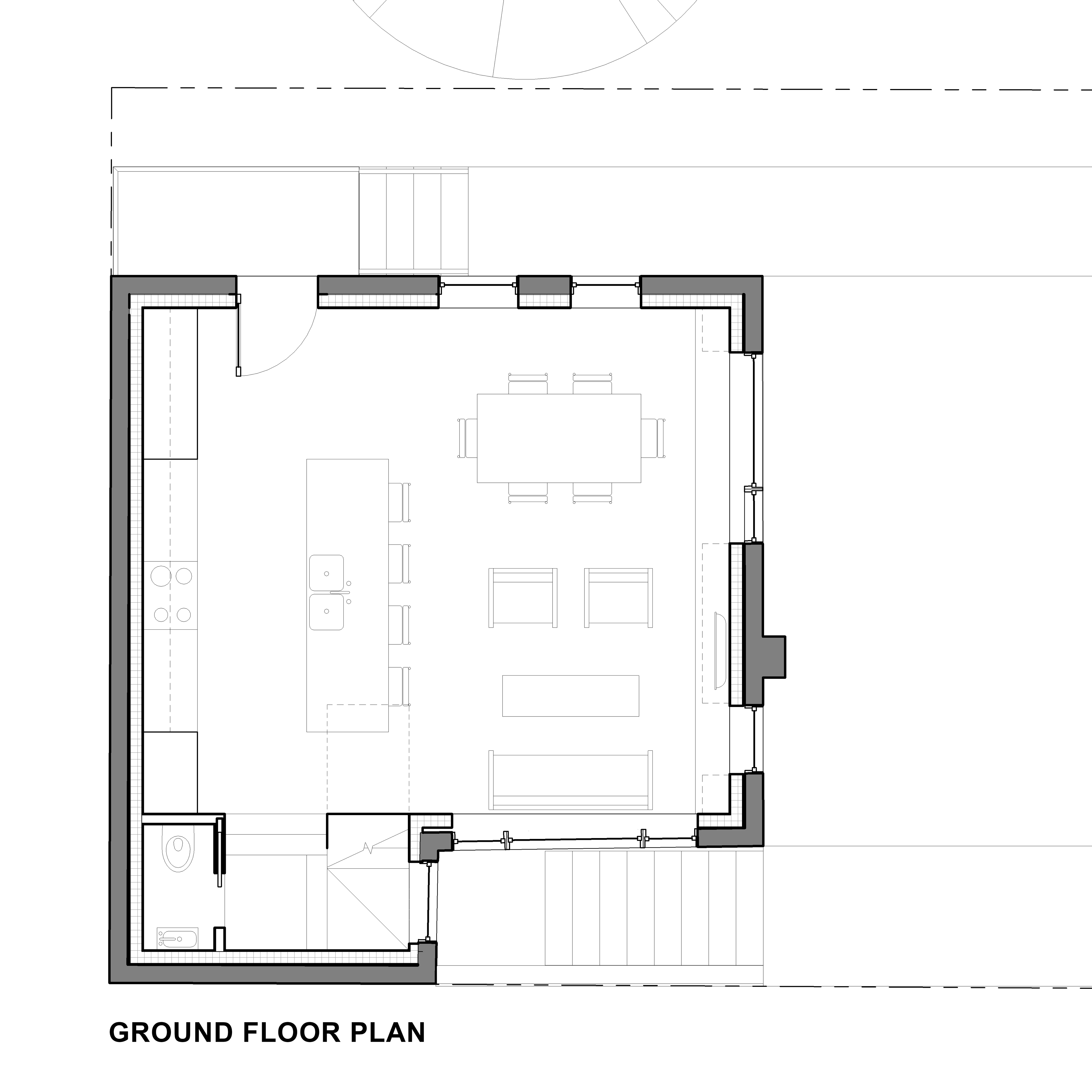
The footprint of the house is 625sf per level. Once we take into account the 8” thick brick walls then the 6” of insulation we are adding to the interior perimeter we have 450sf of living space per level. That’s pretty small! We need to squeeze every inch out of the design to accommodate our needs.
In order to maximize the space of the house and yard we are proposing to move the front porch to the north western corner. A former window will be enlarged to accommodate the front door. From the porch you will walk directly into one big room which houses the front entry, kitchen, dining room and living room. The front entry will have a large closet that will blend seamlessly with kitchen cabinetry along the west wall. The kitchen will have a large island perfect for food prep, light meals and entertaining. The living and dining spaces will encompass the east side of the house with windows on the north, east and south. We will be cutting two huge openings in the brick walls to let in tons of natural light.
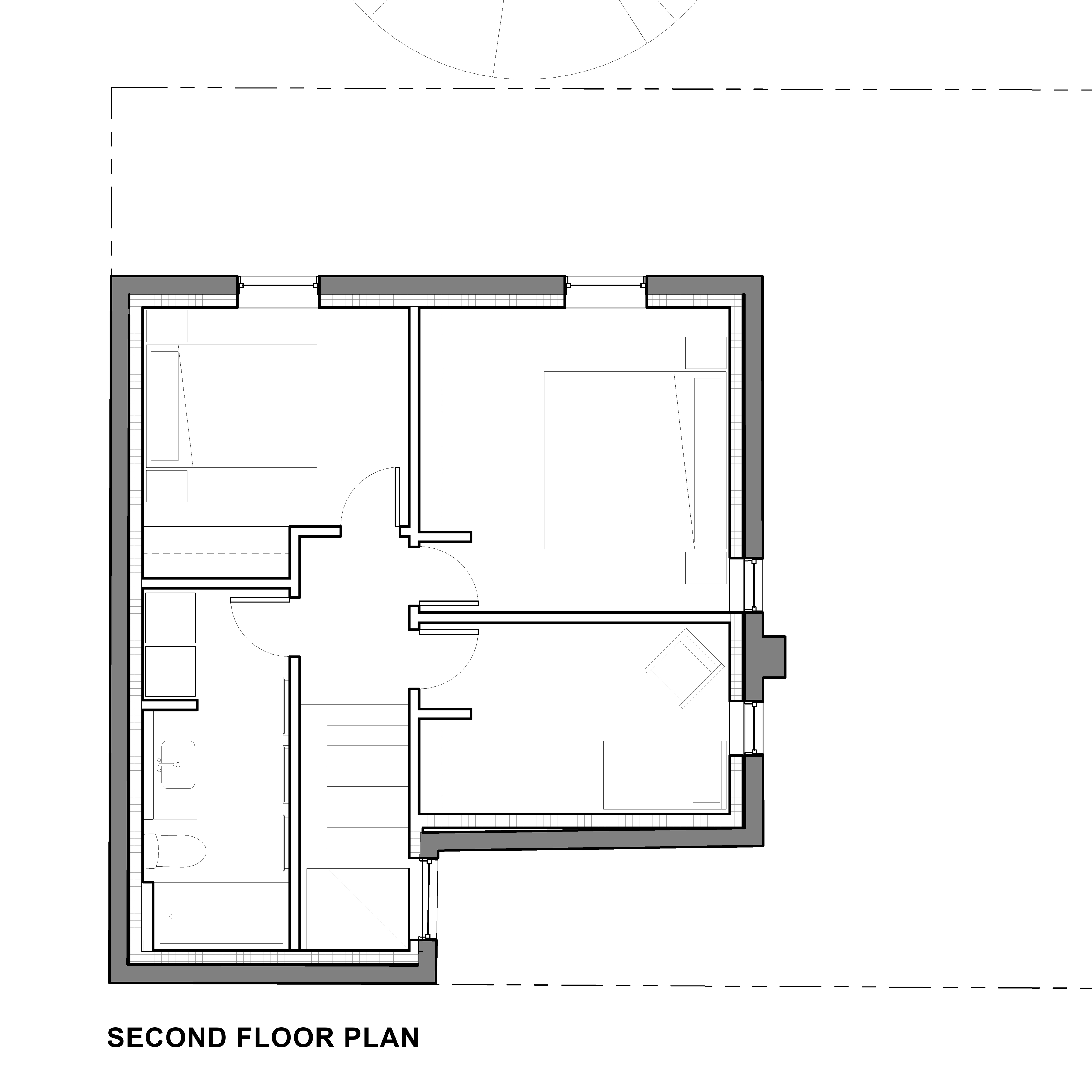
In the small bump around the back of the house we will have an ultra-compact stair and two-piece washroom. Upstairs will be three small bedrooms and a large family bathroom with laundry. We are carefully locating each bedroom to coincide with existing window openings. A couple of skylights will flood the dark spaces with light.
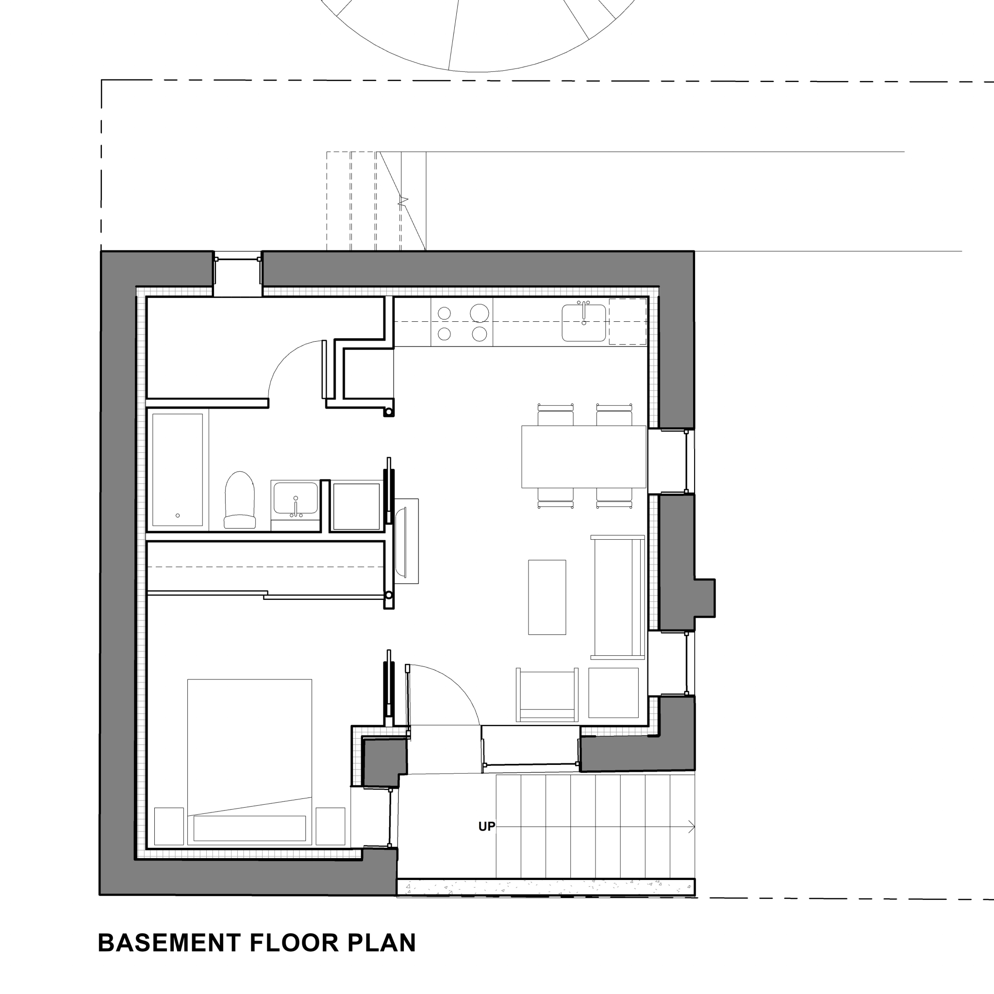
The basement will have a separate exterior entrance in the small bump-in area behind the house. The compact 400sf unit will have an open-concept kitchen, dining, living room, a bedroom with full-height window and long closet, a bathroom with laundry and a small mechanical room that will house the boiler, HRV, sump pit and grey-water treatment system.
The house is small but we feel the design really suits our lifestyle and budget. A lot of people have suggested that we add a third story but it’s just not in the cards for us at this stage. When we outgrow this house, we’ll just have to build another one!
The Energy Audit
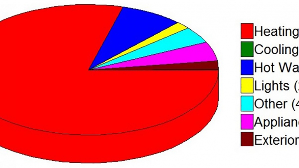
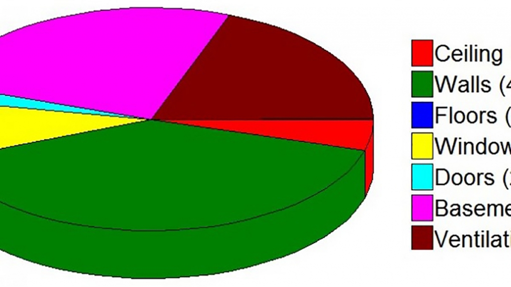
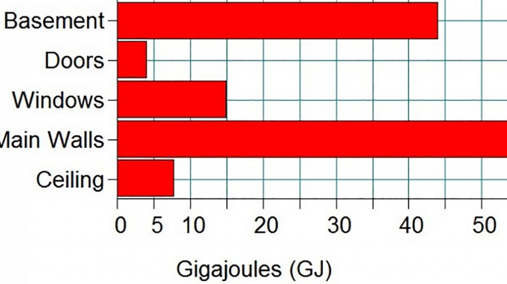
While not mandatory, for major renovation projects we always recommend doing a home energy audit. By testing the energy efficiency of our house before construction, we know where to focus our efforts and we have a baseline against which we can measure our success. Our own home is a chance for us to push the boundaries of budget-conscious energy efficient design, so with this baseline we can see the effectiveness of our implementation.
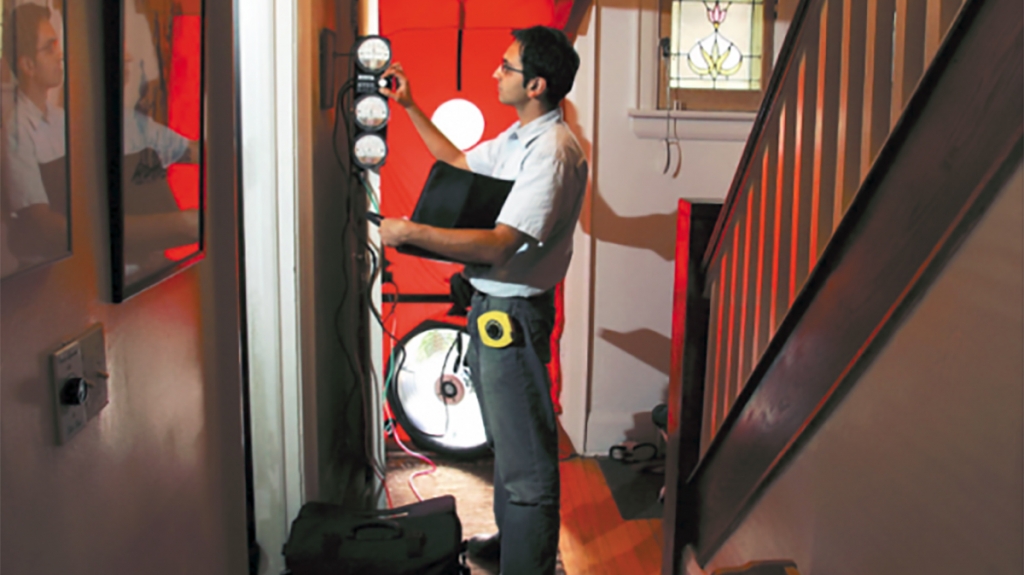
We use Blue Green Group for all our energy audits and performance testing. We highly recommend them because they conduct the initial audit and advise on energy efficiency construction strategies. They also do blower door tests during construction to test the effectiveness of the air barrier. Each blower door test costs about $300, and we think that’s money extremely well spent – once the house is finished it’s too late to fix the air barrier! Upon completion they conduct a final audit to tell us how well we’ve improved the home’s energy efficiency.
The existing EnerGuide rating for our house is 38. That’s lower than the Canadian average of 44 for houses of the same age. For us this is exciting news because it give us so much potential for energy upgrades! With attention to insulation, mechanical systems and reducing air leakage, we are aiming to reach an EnerGuide rating of 82. This would result in nearly an 83% reduction in energy consumption!
While most new-build Solares projects reach EnerGuide 87-88, our house presents some unique challenges to attaining that rating level: Our site has limited solar exposure, which reduces our capacity to use the full gamut of passive solar design techniques. There are also limits on insulation and air sealing in a retrofit situation such as ours. Our dream would be to reach a 90% energy use reduction, but we’ve decided to keep our eye aimed on a challenging yet realistic target.
The results of our initial blower door test shows a baseline air leakage rate of 7.72 air changes per hour (ACH). ACH refers to the number of times that the total volume of air in the home is replaced by new air from outside through the process of air leakage. A house with a high ACH value will require more energy for heating and cooling, since it will need to temper new air more frequently. And while it’s true that older, leaky houses don’t require mechanical ventilation, they certainly consume a lot more energy for heating and cooling!
For our house, we’re aiming for 2.0 ACH, a huge reduction from the original 7.72. We will be providing fresh air with a top-of-the-line ERV (Energy Recovery Ventilator), so we’ll be keeping Tom’s favourite motto in mind: “Seal it tight, ventilate it right!”

Pre-Construction Must-Dos
We have our house, we’re ready to renovate… what do we do first? Like any major investment you do your due diligence, right? Here are two major pre-construction “must-dos”
(1) Get an official building permit from the local authorities. Having an official building permit is important for life safety (during and after construction), labour laws, zoning bylaws, and resale. Basically, it’s about making sure you’re legally covered and that everyone is safe.
You need to give yourself a lot of time for the approval process. Since we want to keep this project moving swiftly, we decided to approval-proof our application by avoiding certain things that could prompt extended review – things like a large addition that would encroach into setbacks, a new third storey that would add square footage, or construction within the tree protection zone at the front of the property.
Our application is in, including all the required paperwork and detailed drawings. Until we get our approval we can’t do any major construction. However, while we wait we can do a full interior demo and strip-out so things are ready to go as soon as we have our permits in hand!
(2) Conduct a soil test. Testing the soil is very important for locating the water table and for understanding the soil’s stability and bearing capacity. Basically, how deep and how much can you build? This all relates to building height, basement depths, whether or not you can add an addition, and designing the right foundations.
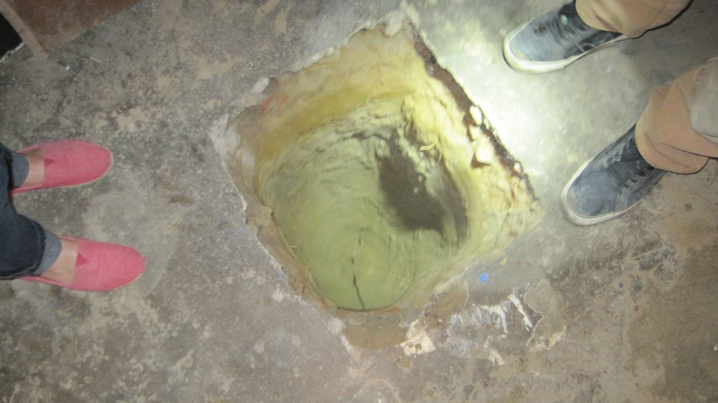
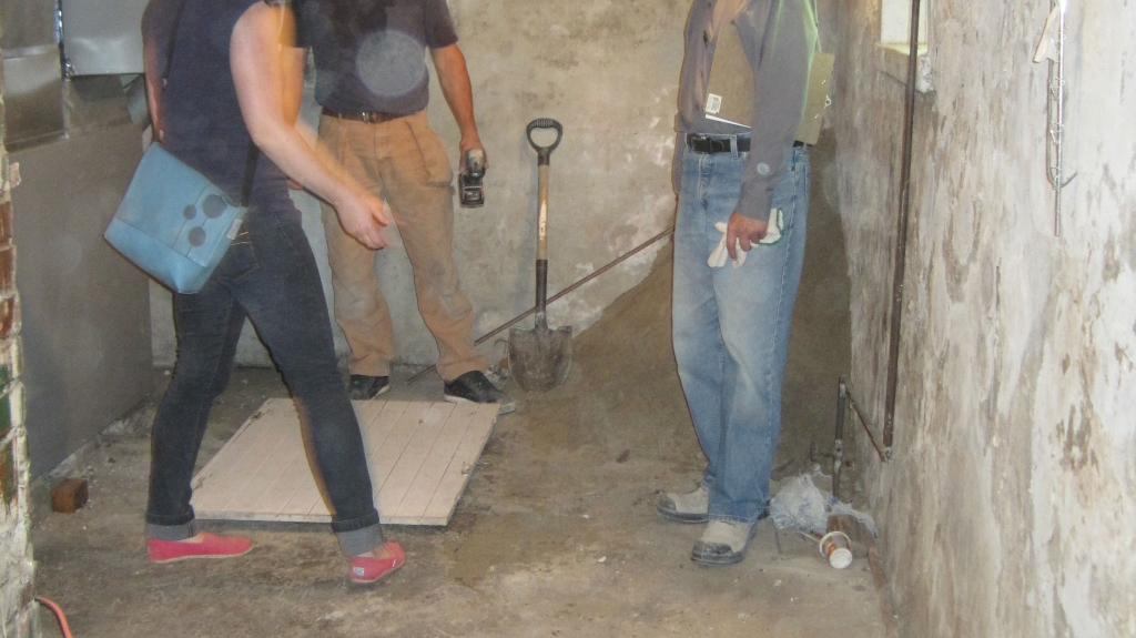
A soil test starts with digging a hole. We decided to dig it right and dig it deep – ours went down five feet! We hired Soiltest Services Ltd to dig the hole and inspect the soil striation to see what’s layered under the house. They look for things like a “hidden” layer of unstable soil below otherwise stable layers, as well as other things that could impact design decisions and cause construction delays.
We are happy to report that not only is our hole perfectly dry, but the test showed a single, solid layer of pure, silty sand. This means we’re good to go with no need for remediation or design changes! This was truly the BEST $750 “wasted” – investing in a test that shows no problems is the ideal result!
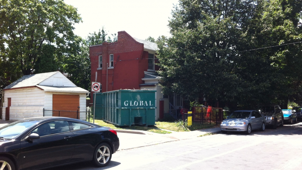
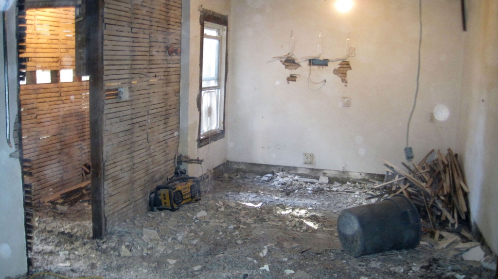
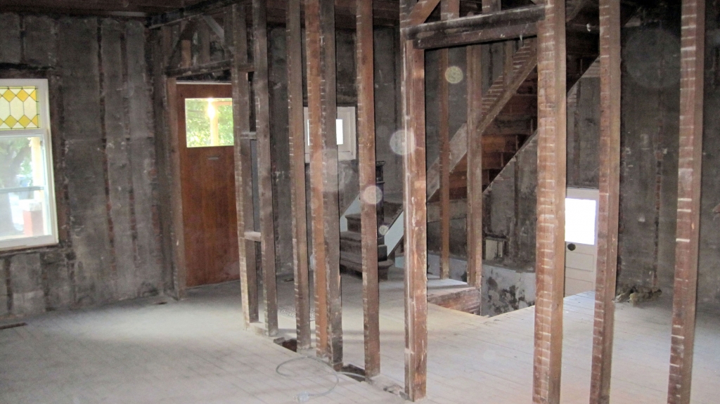
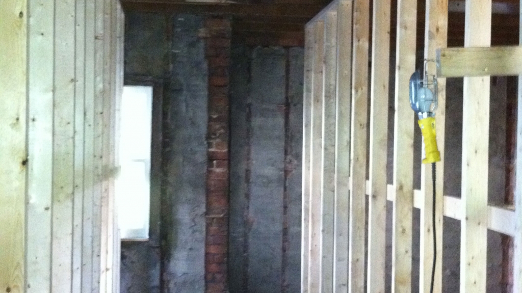
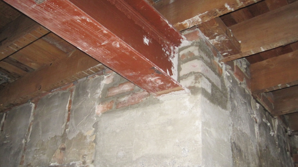
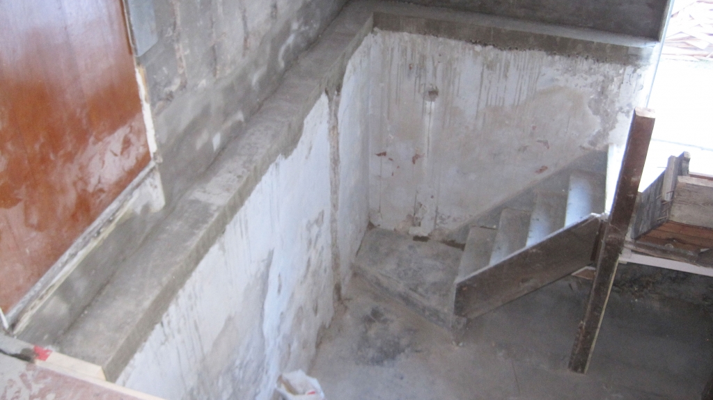
We’re finally getting our hands dirty with the demolition phase! We’ve now finished the process of stripping the house of everything interior, from floor to ceiling, as well as opening up the enclosed front porch. For now, we’ve left the central framing as is since there are load-bearing walls that will need more specific attention during the heavy framing stage – stay tuned! Limiting waste and reducing fuel usage is very important to us, so our whole team took care to strip things down neatly and pack everything carefully into a single dumpster. That’s right, we only filled one big dumpster for the entire demolition process! Typically, major renovation demolition for a home can fill dozens of dumpsters, adding cost to the project and burning more fuel to transport each one to landfill. We also found new uses for reusable items – for example, one of our new neighbours took all the interior doors to repurpose as a room divider for an interior design project. Stripping a house can illuminate more information about the house you’ve bought, and ours was no exception. We found a giant wasps’ nest inside the flat roof ceiling, which would have lurked there for many more years had we not opened things up! While doing a full strip-out can increase the overall budget, we are very happy to have a thorough and fresh start with this old Toronto house. The cost for us is simply part of the project and not an extra. What’s more, it’s often the less fancy interventions that make a huge difference. The removal of the front porch enclosure alone had many neighbours remarking on how much they love the new look of the house! We’re happy with it too, and feel excited to now be working with a bright, open canvas – after demolition it feels like things are really moving!DemolitionGo To Project Page
Heavy Framing
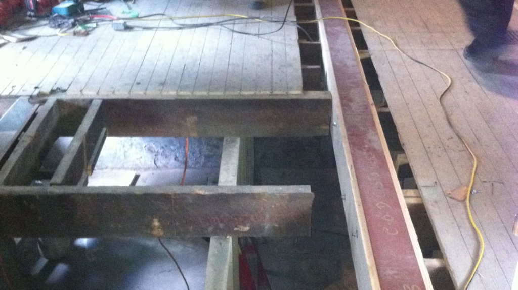
Now that we’re finished with the strip out and demolition, we finally get to remove those load-bearing walls to open up the space! Load-bearing walls can only come down concurrent with installing new load-bearing beams in their place. In our case, we’re using beautiful 10” steel beams sourced by our framing contractor.
On the main floor we’ve decided to locate the beam below the ceiling so that it becomes an interior design element, whereas in the basement we’re putting it flush with the ceiling for maximum ceiling height. On the second floor we decided to keep the interior load-bearing wall in place, since we want to maintain the division of space for the bedrooms and bathroom anyway. This one bit of wall will be the only original interior wall remaining.
The process for installing the beams is very clever: shoring is built on either side of the load-bearing wall to support the structure above while the builder installs the beam. Shoring is essentially a temporary prop that prevents a structure from collapsing until the main supports are in place. In this case, this is done with two makeshift walls placed on either side of each load-bearing wall to be removed. Once the shoring is in place, they remove the load-bearing wall and install the new beam in its place. Lastly, the shoring is removed and voila – open space!
In addition to removing the basement and ground floor load-bearing walls, we’re relocating the stairs. On the ground floor, we felt that the existing stair location in the north-east corner is actually the nicest corner of the house! In order to use that spot for living space, we’ve moved the main stair to the south-west rear corner and have reframed the floors to accommodate the new location.
We have also committed to creating a separate rental unit in the basement by moving the basement stairs to the outside. This gives us storage space under our own interior staircase, and provides our future tenant direct, private access to their apartment. For our purposes, we will only need access to the basement mechanical room for infrequent maintenance. Moving the basement stairs required new underpinning and concrete work to create the stairwell and landing space.
The new beams are in, the stairs are relocated, and the place feels bright and airy. The beam on the main floor is a beautiful design element that acts as a gentle, permeable zone divider. And – we will officially be landlords for a new rental suite!
Foundation Underpinning
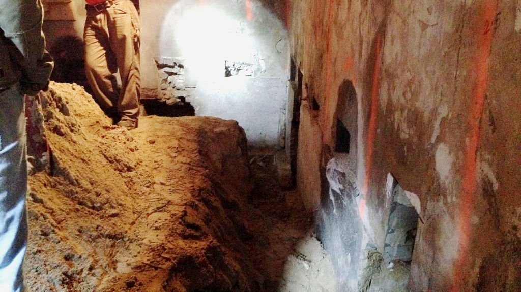
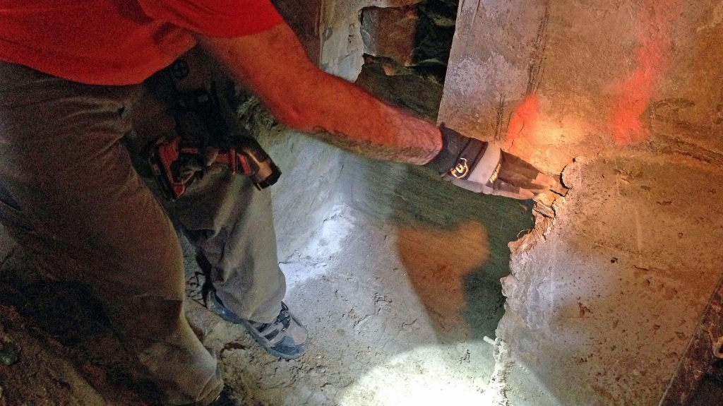
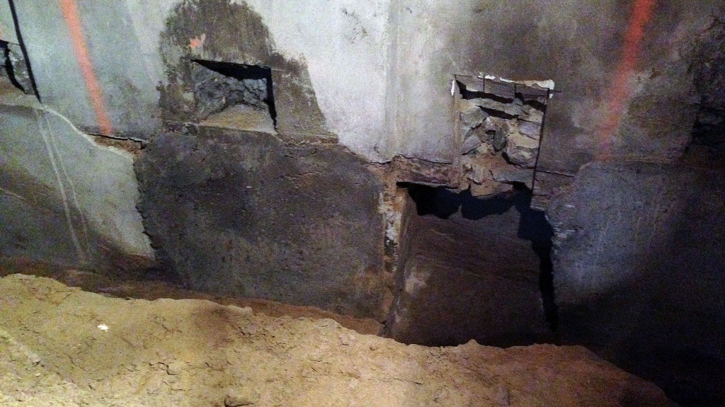
The next major structural stage is the gloriously messy job of underpinning! Underpinning the foundation allows us to create a nice, high ceiling for the lower level apartment by lowering the foundations and basement floor slab. The process is very specialized and must be done carefully and methodically by underpinning specialists.
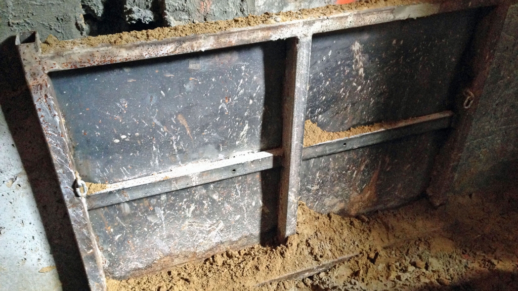
Generally speaking, underpinning is done by digging out the soil from under the existing footings to the new desired depth and then filling that space with new concrete – in small sections at a time to prevent collapse! In order to fill the cavity completely, the typical method ends up with extra wall thickness up to the fill line, decreasing the square footage of the basement. For our house, however, we’re using a different technique that allows for the added footing depth to be fully flush with the existing foundation walls. We love this technique because we don’t lose any of our precious floor space, and it’s less labour-intensive and therefore less costly than other flush-wall techniques. Besides, it’s so very clever! The method uses a keyhole system above the pour zone, which is quick and easy to fill with grout after the new concrete has cured. We’re working with the experts at Tall Basements who have streamlined the process and have even tailor-made their tools and formwork specifically for this technique.
As well as maximizing the floor space for the tenant suite, the underpinning will create a ceiling height that far exceeds the Ontario Building Code’s minimum requirement. The Code requires a minimum ceiling height of 6’-7” in basement suites and ours will be 8’-6”! When we committed to a rental suite in the first place, we also committed to creating a bright, beautiful space that will allow us to seek a higher rental fee and increase the chance that the tenant will stay for the long term. It’s not only pragmatic from a financial standpoint, but it’s also important to us that whoever lives under our roof feels happy and healthy in their home.
At the same time as underpinning the basement, we’re adding a new exterior stair for direct access to the new tenant suite. When we did the heavy framing we removed the interior basement stair in favour of having a private outdoor entrance for our future tenant.
We’re excited about the new tenant suite taking shape! Let us know if you have any questions about the underpinning technique we’re using. We’ll be happy to get into the details!
Update: New Floor Plans!
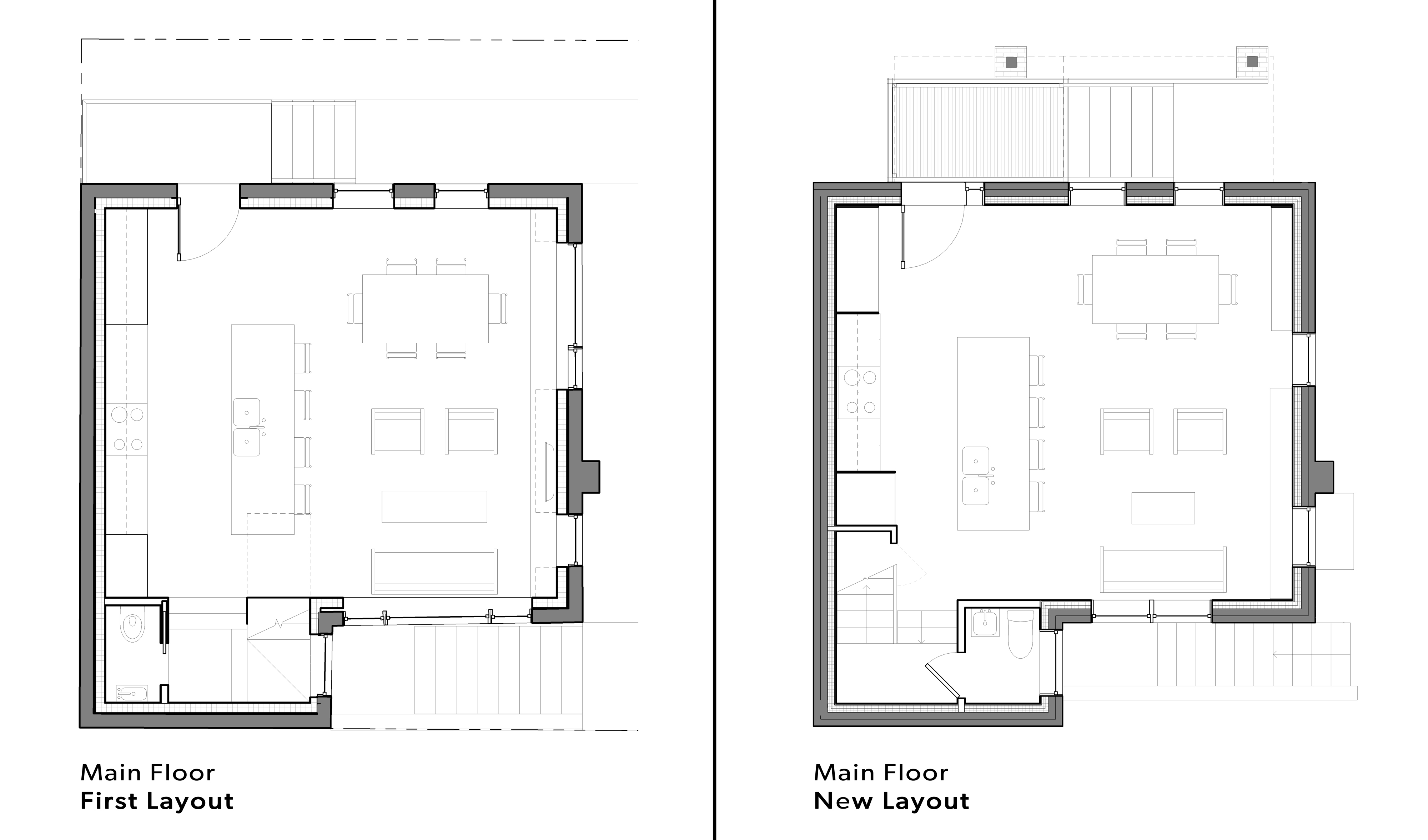
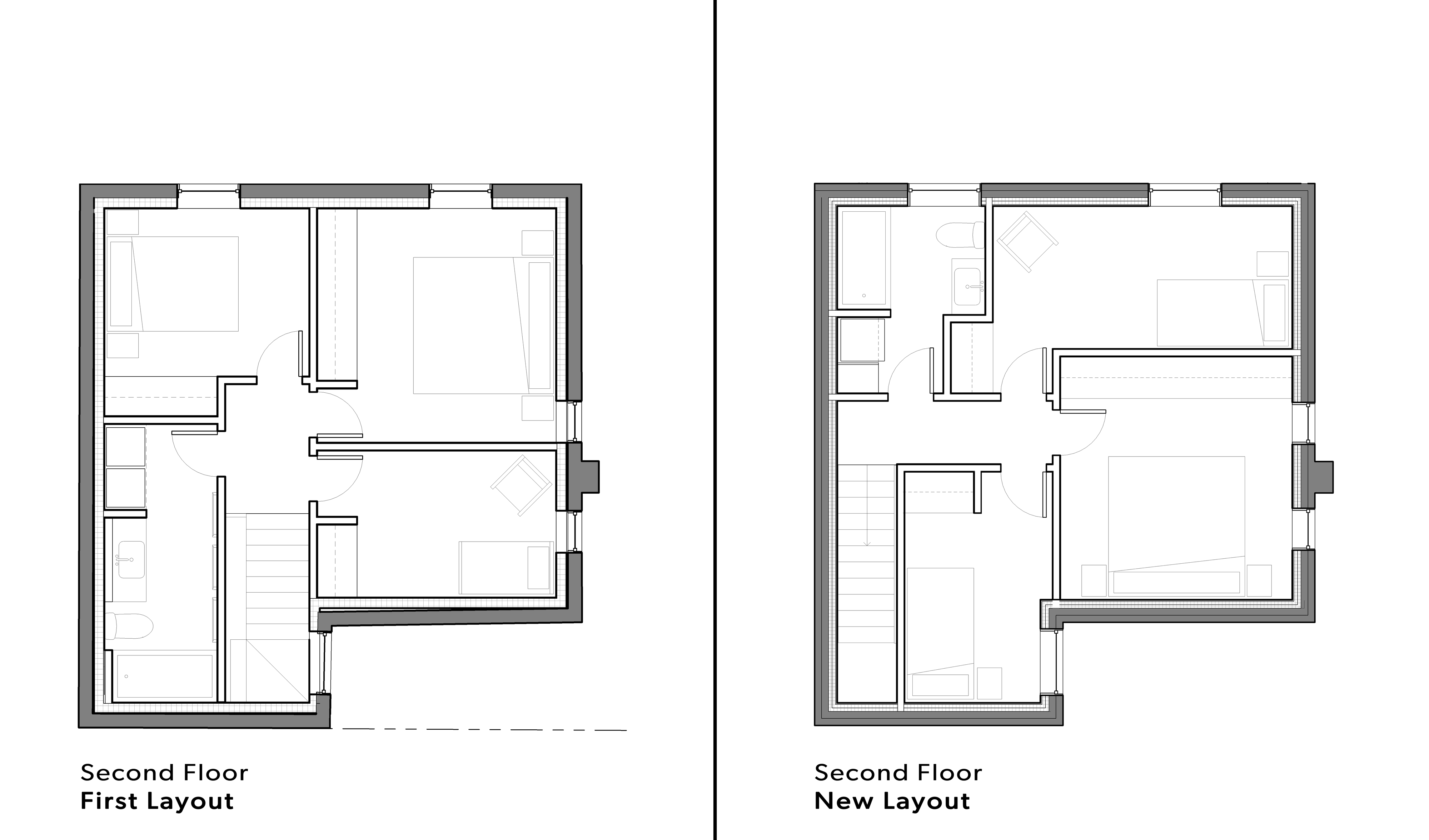
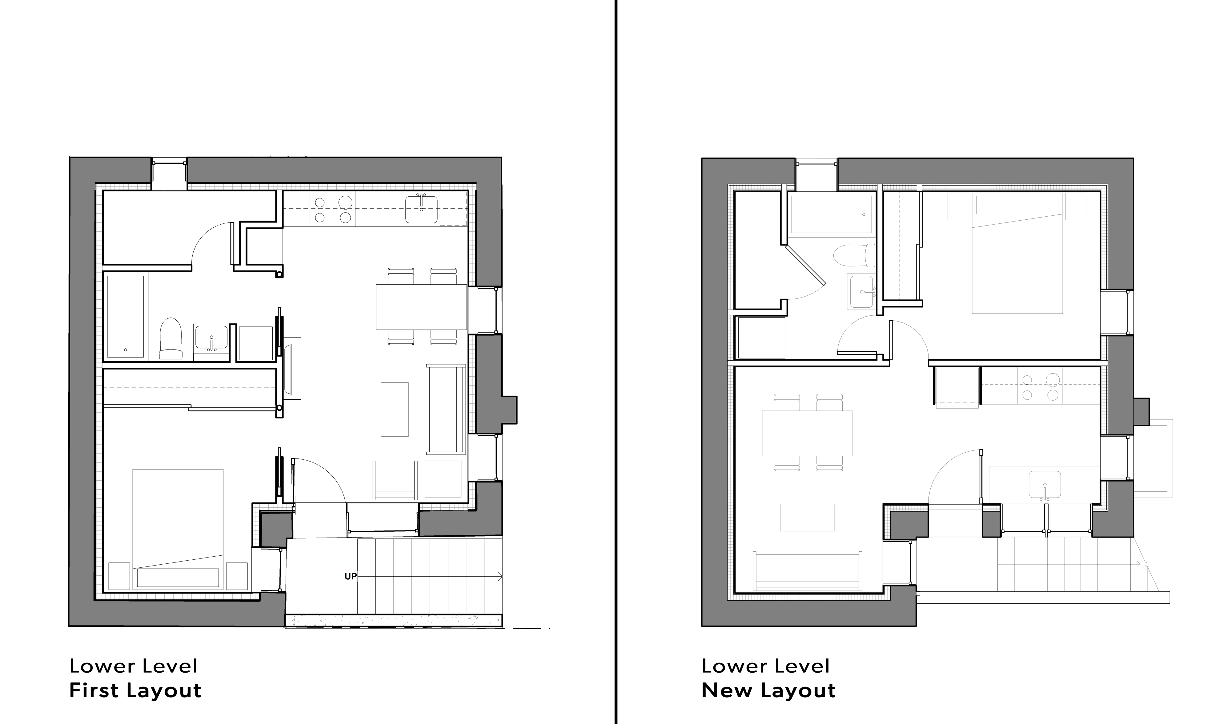
We’ve redesigned the floor plans! In every project, we want to be responsive to the process and as nimble as possible. The critique of our work doesn’t stop until we have the best possible design! In the case of our house, we realized post demo that with some key changes to our initial floor plan layouts we could improve the beauty and usability of all three floors. After giving it careful consideration – to make sure the changes were feasible – we decided to go for it! Here’s the breakdown, by floor level:
Main Floor: In the first layout, in order to fit the stairs in that location, we had a rather treacherous series of steps, with angled winders and treads that only just met building code minimum depths. The top of the stairs over the kitchen island presented limited headroom and created a feeling of division between the kitchen and living room. The amount of new window openings was very expensive. The new floor plan shifts the stairs to the south-west corner, allowing us to extend the length of the stair and normalize the runs and treads. The powder room has shifted to where the stair used to be, giving it access to the east window. The space under the stair will house the fridge and a sorely needed “broom closet”. We scaled back the new window openings and put that budget towards other things. We are still enlarging some windows, but to a smaller extent, and are only adding one new, modest-size opening to match the other windows.
Second Floor: The initial layout was informed by the location of the main stair, with all rooms opening directly onto the top landing, lit overhead by a skylight. The main bathroom was spacious and lit with a second skylight. The two main bedrooms for us and our kids were at the front of the house, with a third room designated as a spare room and study. In the new plant, the updated location of the main stairway makes the second floor layout easier to resolve! By repositioning the top stair landing all the way to the west wall we were able to design a more hall-style circulation area, and create more appropriate room sizes and locations. And the bathroom now has an operable window for natural ventilation! We also saved cost by cutting down to just one skylight.
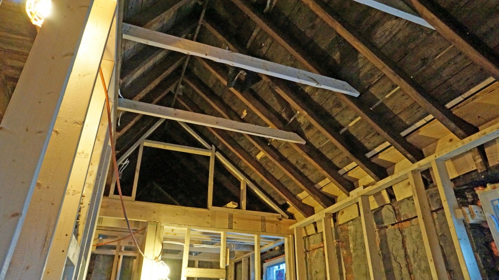
Little did we know when we first designed the layout that during demolition we’d discover a beautiful, vaulted ceiling at the front of the house! In the new layout we’ve designed the playroom to take advantage of the fabulous 12’ ceiling height. The bathroom has a flat ceiling to create an attic-like space above for storage and for the location of our ERV.
Lower Level: Originally, the entrance to the rental suite opened onto the living room, with the bedroom on the left in the south-west, and the dining area, kitchen and bathroom beyond. The kitchen lay across a single-wall with space for a dining table next to it. The bathroom opened onto our mechanical room on the north side. Overall, we opened many of the windows to bring in lots of light, and made a new opening next to the door for a large, south-facing window onto the living room.
In the new layout, the entrance opens onto the space between the kitchen and the living-dining room. This makes the entrance zone more usable for arrivals and creates space for a larger, galley-style kitchen with more counter space. With the kitchen at the entrance, the new window opening at the door combined with an east-facing window means the kitchen will be brightly lit throughout the day. The living-dining room now occupies its own zone in the south-west corner with no doors coming off of it, thereby maximizing the usability of the space.
The bedroom is now in the north-east corner of the suite, with more space around the bed and direct access to the bathroom. We moved the bathroom away from the public zones of the suite for privacy, and it now has the north window that was previously in the mechanical room. We made the mechanical room a smaller, closet-style space, since the energy-efficiency of our house requires only small-scale mechanical equipment. Overall, we increased the floor area of the apartment, brought more light to more spaces, improved the circulation and created a more usable kitchen!
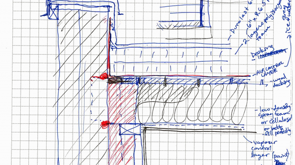
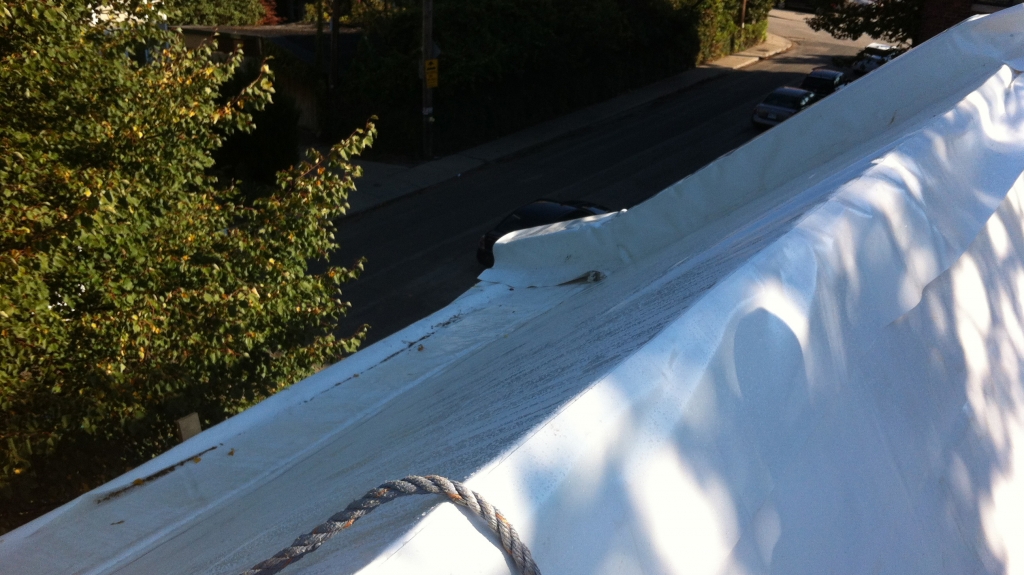
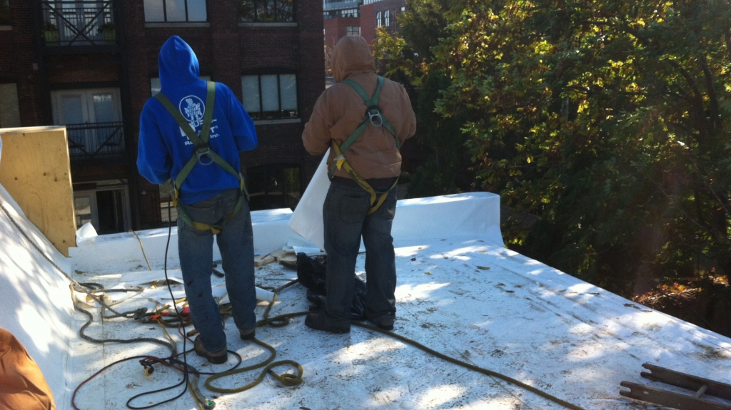
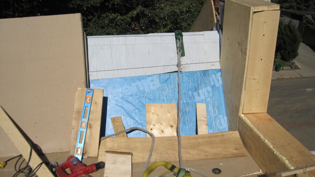
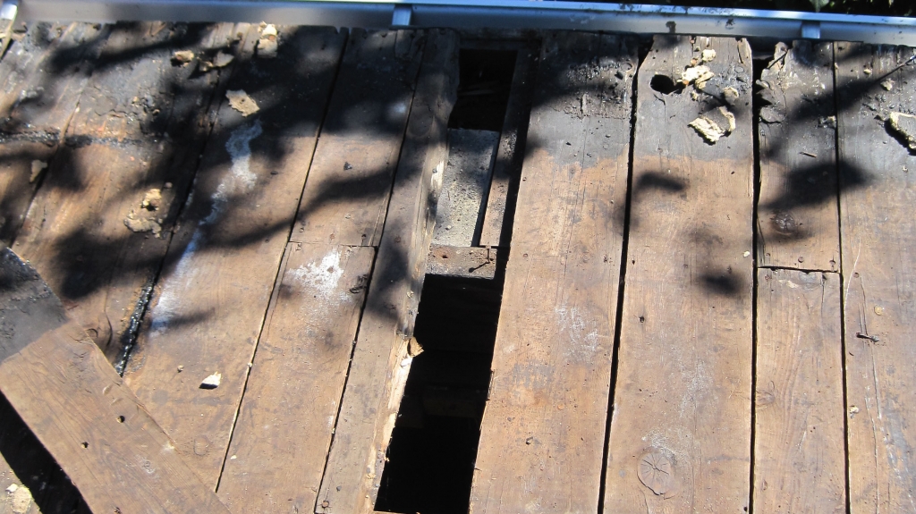
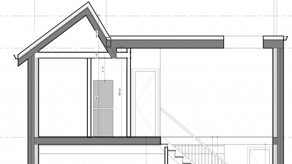
The roofing solution for our house is something we’re particularly excited about. We’re taking a less conventional approach that will give us a very long-lasting roof, contribute to a durable, well-sealed and well insulated building enclosure, and offer us flexibility with lighting design and other ceiling penetrations. The big idea was born at a Roxul seminar where I ran into our former professor John Straube. John is a brilliant building scientist, so I (politely) cornered him with ideas for our roof! Together we hashed out an innovative design that uses a more commercial-style approach. I brought the idea to our roofer, Mike Beauchemin of Eco-Tech Roofing, and together we further developed our roofing strategy. Eco-Tech specializes in interesting, alternative approaches to roofing. The first reason we’re not doing a typical residential roof is that we have a mostly flat roof with only a small peaked area at the front. The typical residential, insulated, attic-style roof uses batt insulation in the ceiling with a 6 mil poly inside to create a combined vapour and air barrier. Most importantly, the top of the insulation is ventilated. While this roof-type can work well, it is very difficult to seal properly because the air barrier layer often gets punctured by things like lights, walls and pipes. Our roof, however, puts that air barrier outside of the building and is more like a commercial roof. This gives us a better air barrier, more insulation, and more internal space under the small peaked area at the front of the house. Here’s a break-down of the assembly, from outside to inside: Exterior Roofing Product (outermost layer). We’re using Duro-Last roof membrane for the outermost layer, which is a product more typical of commercial roofs. It’s a white, “cool roof” product that reflects the sun’s heat, which reduces air conditioning loads in the summer. This means we’ll have less heat gain in the summer because the majority of the sun’s heat bounces off of the light-coloured roof – this high solar reflectance is known as a high albedo rating. This also reduces the overall strain placed on the roof, with means the product will last much longer than darker alternatives. Duro-Last is applied in sheets that are rolled out and essentially welded together with an iron to form a continual layer. It’s a bit like a swimming pool, leaving no way for water to penetrate. Rigid Insulation. Just under the waterproof roof membrane are two layers of 3-inch rigid polyisocyanurate insulation (polyiso) placed with staggered joints. With an insulation value of R6.5 per inch, this layer contributes R-39 to the assembly, exceeding the building code standard of 33 for residential flat roofs. Air Control Layer. This seemingly small item is the most important part of the roof assembly. It’s a peel and stick waterproof membrane – in this case we’re using a combination of Blueskin and Grace Ice & Water Shield. The purpose of this layer is to create a continuous, air-tight layer that connects across the roof as well as to the air-tight layer in the walls (in this case a closed-cell, spray-foam insulation). This approach creates an air-tight seal because the wood decking is covered on both sides, with the membrane on the top and the spray-foam on the bottom along the entire perimeter. The combination of the Blueskin and Grace products also provides us with another waterproof layer – as soon as it was installed, the house was water tight! Wood Decking. Next in the assembly is the wood decking. We replaced sections of the original decking that were rotting with thicker plywood, and then covered the entire roof with an added layer of thin plywood to create a uniform finish. Interior Insulation (we’re now officially inside the building). Since we have high-levels of insulation on the outside, as well as an air barrier, we only need an inexpensive, loose-fill insulation on the inside. We’re still assessing the option of using a low-density, water-based, spray-foam product like Icenyne; otherwise we’ll go with a cellulose or batt alternative. Whichever we choose, it will need to fit perfectly within the cavity so there are no air spaces. The insulation value of this layer will average across the roof to about R-27. With the exterior polyiso already exceeding code, this layer makes the roof really out-insulate the provincial standard – a practice we aim for with all our projects! Vapour Control Layer & Ceiling (inner most layer). Instead of plastic sheathing, our vapour control layer will be a simple primer product applied to the interior of the ceiling drywall. Benjamin Moore’s Super Spec™ line includes a low-permeability latex vapour barrier primer, which essentially means that humidity won’t be able to penetrate through to the inside of the roof assembly, preventing the build-up of mould and mildew. This does not have to be very strong, because we have a consistent air barrier above; this layer only needs to prevent the relatively weak moisture drives of the interior from entering the enclosure. In total, our roof assembly has an extremely high insulation value of R-66, which is about double the requirement for a residential flat roof. More importantly, it’s a vital part of our air-tightness strategy, since we are trying to meet or exceed the super-low level of less than one air change per hour during a blower-door test (that’s 1.0 ACH @ pa50). One of the downsides of this roof is the cost of the membrane and the additional framing required to accommodate the thicker roof profile. However, we’re hoping that cost is offset over the years, since it should have a lifespan much longer than a typical asphaltic flat roof. In fact, our roofer has assured me that I’ll retire with the same roof! The roof is coming together quickly and with high-quality installation. Building our own home means we get to design solutions we’ve always wanted to try, and this residential roof innovation is a great example.The RoofGo To Project Page
Framing’s Complete, Windows are In.
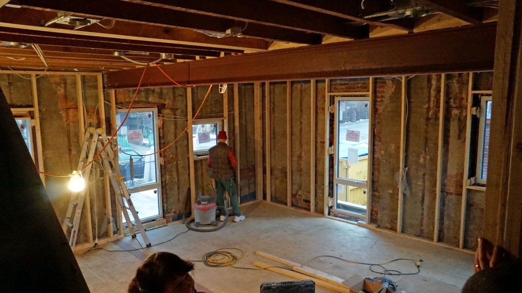
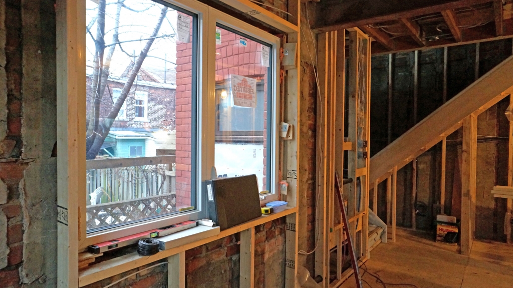
All the framing is now complete, and the main staircase is fully installed. We framed the outer walls with 2×4-inch studs placed every 24 inches, instead of the usual 16 inches. We also offset the studs a minimum of 1” from the face of the brick. With these two strategies, we can spray more insulation between and behind the studs, which helps reduce thermal bridging. By reducing the number of conductive spots, we’ve increased the overall effectiveness of our insulation.
We originally wanted to use small 2×3-inch studs and use the extra inch for even more insulation, however the normal wood stud at that size is terrible for twisting and warping. We did try to source finger-jointed 2×3 studs, which are much stiffer and more stable, but they were impossible to find! If you know where to get 2×3 finger-jointed studs we’d love to hear from you!!
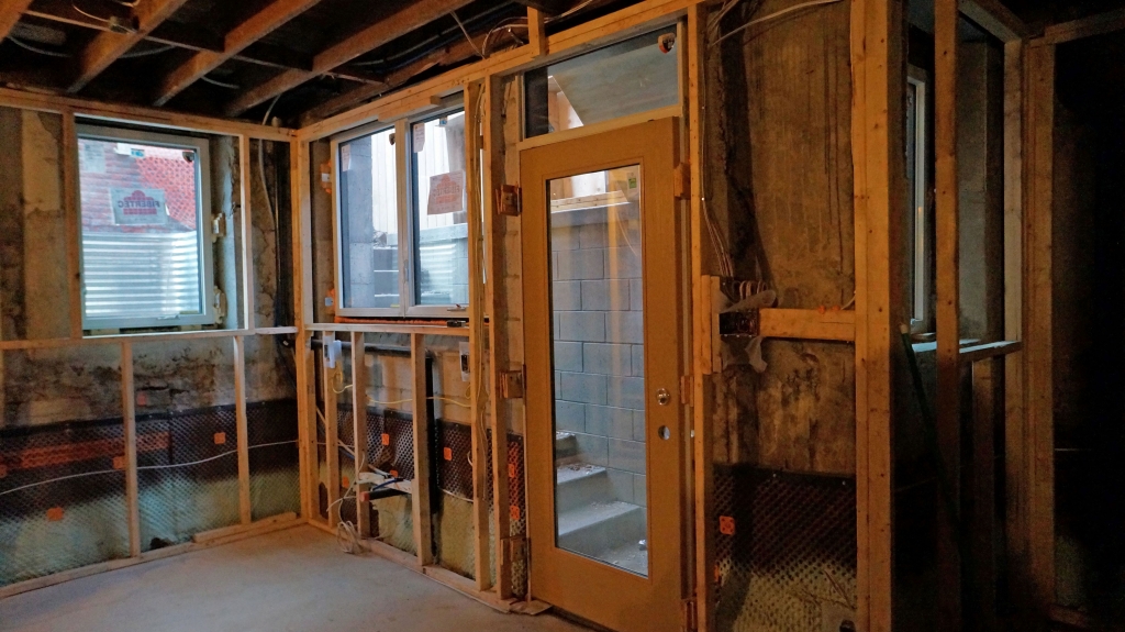
And, the windows are in! We like lots of light, so not only did we design our house with lots of windows but we also opened two large holes in the brick at the back of the house to make space for big, south-facing windows – one on the ground floor for our living space, and one on the lower level for the rental suite. These windows will help us take advantage of passive solar heat gain in winter, while in summer they’ll be shaded by the large, leafy trees in our neighbour’s backyard! All of our windows are triple-glazed fibreglass units from Fibertec.
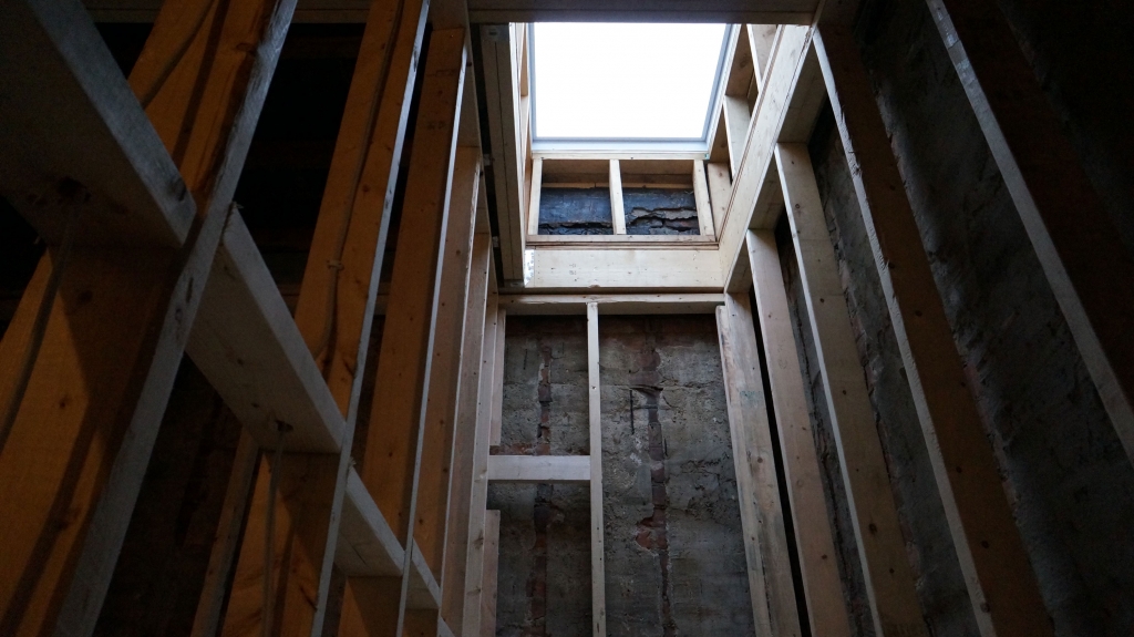
Upstairs, we have a skylight over the staircase, and will be installing a solar tube over the hall outside the bedrooms. The skylight is an operable, triple-glazed unit from Allied Plastics, run by an electrical motor controlled at a wall switch. We love the skylight not only for the light and ventilation it provides, but for the views it gives of the sky and nearby trees. In order to limit associated heat gain/loss, we’ll be dressing it with a thermal, black-out blind from Hunter Douglas, also controlled at a wall switch. The blind will help keep the heat in on cold winter nights and out on hot summer days.
We’re also installing a solar tube by Solatube above the upstairs hall. Essentially, a solar tube captures daylight and channels it down through a highly reflective tube to significantly brighten an otherwise dark space. This means that during the day we won’t need to turn on any lights at the top of the stairs! The tube’s diameter is only about 10 to 14 inches, but its inner surface is so reflective that it can bring in an enormous amount of sunlight through a tube as long as 20 to 30 feet! With limited outside surface area, the tube doesn’t contribute to summer heat gain or winter heat loss – it only transports light, not heat!
Seal It Tight, Insulated It Right
Our house is going to be an extremely well insulated and energy efficient home!
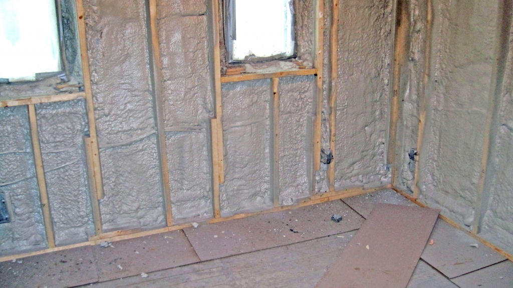
We’ve focused on high insulation levels in both the walls and the ceiling, and a well-sealed envelope. Our wall framing uses 2×4-inch studs placed every 24 inches, and our ceiling is part of a more commercial-type roof assembly unique for a residential project.
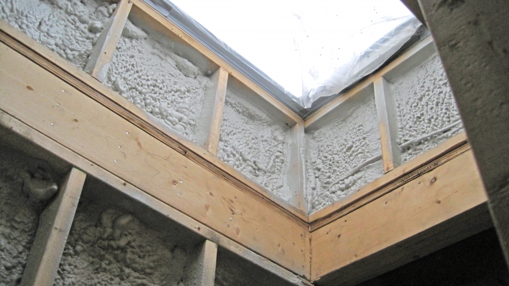
In our walls, we’re using 4 inches of a water-based closed-cell 2-lb polyurethane spray-in-place foam insulation by Icynene, installed by CallRich Eco Services. With an insulation value of R6.75 per inch, that gives us R27 in the walls.
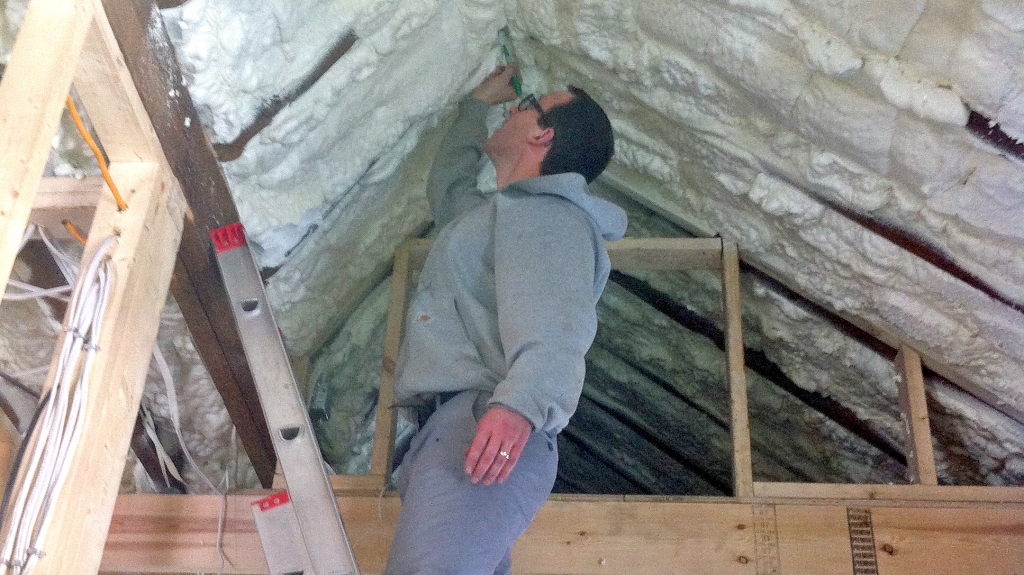
Between the rafters in the ceiling we installed an open-cell 1/2-lb insulation, also a polyurethane spray-in-place foam product by Icynene installed by CallRich. We’ve used 1/2 lb in the ceiling because we already have an air barrier above the roof structure (the roofing membrane on top of the sheathing), and above that we have 6” of polyisocyanurate board insulation. We wanted a vapour-open product between the rafters in order to prevent creating a “vapour sandwich”, which could trap moisture in the roof structure and lead to rot.
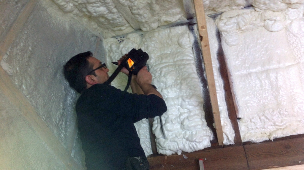
Once the insulation was in, we put our air barrier to the test before starting any drywall. Shervin from Bluegreen Group went around with infrared cameras looking for all leaks and “micro” leaks in the entire building envelope. We marked them out, and over the course of two days went back and sealed each one with acoustical sealant.
Acoustical sealant is perfect for sealing air leaks because it never really dries. It remains somewhat viscous, allowing it to flex and continually do its job even with shifts in the framing during seasonal temperature and humidity changes. In the industry it’s commonly known as “The Black Death” – its colour is black, and it’s extremely sticky and difficult to get off your hands! But in spite of that, it sure does work.
After fixing the leaks we did an official pre-drywall air leakage test, which revealed an air leakage rate of 2.74 ACH@50PA. That’s a 65% reduction from the pre-retrofit tests. Now that we’ve patched all the hard-to-find leaks, the final test results will be even lower! We’ll be testing again after completion to determine our final air leakage result and our overall energy efficiency rating.
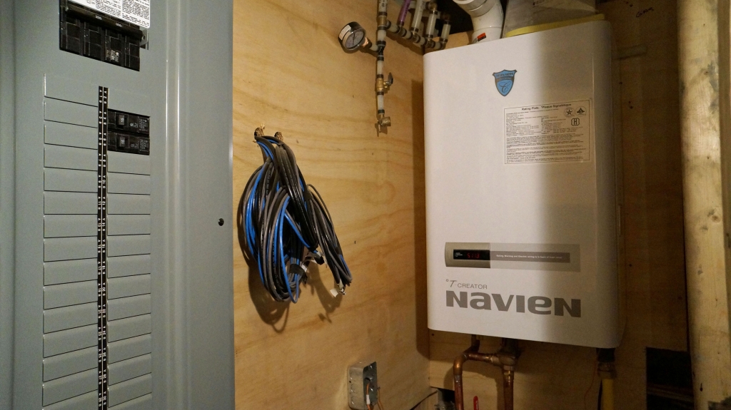
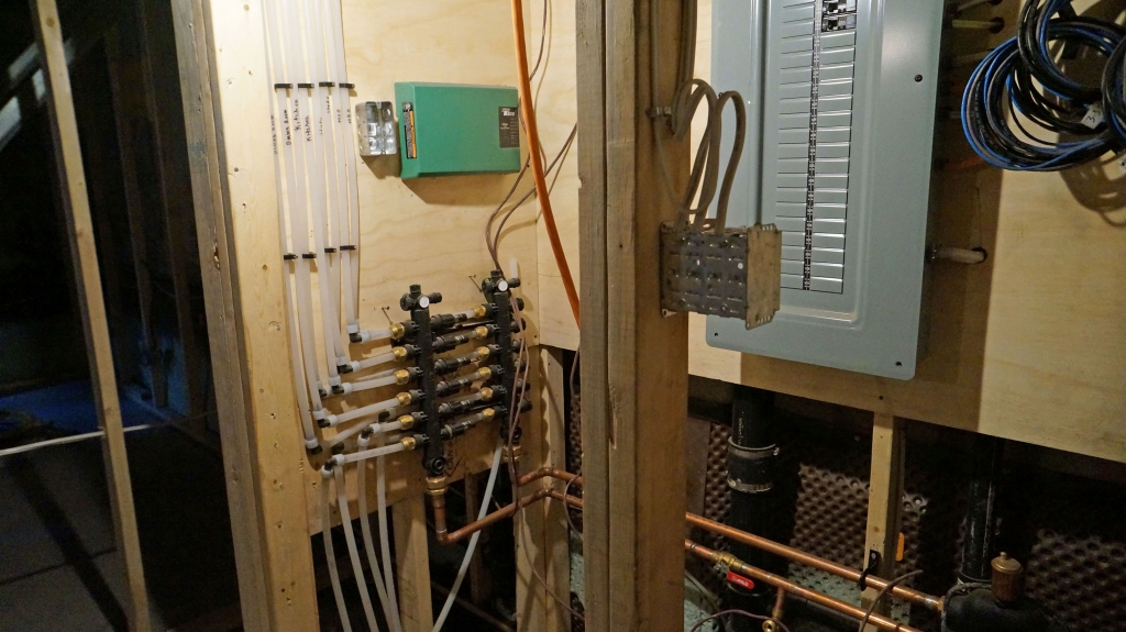
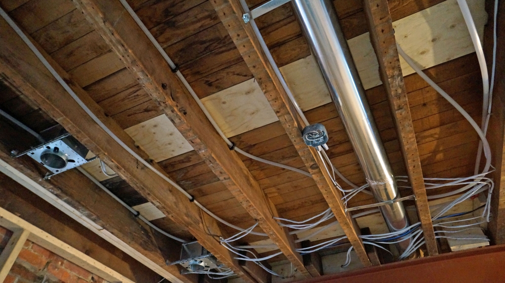
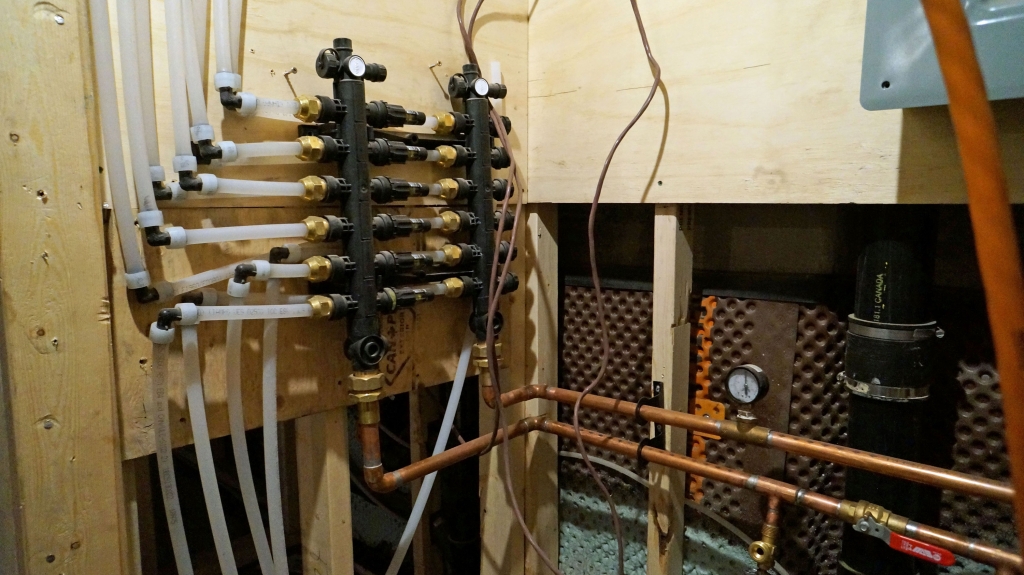
HVAC is the acronym for Heating, Ventilation and Air Conditioning – essentially, all things related to indoor comfort. It is commonplace that these systems are oversized in residential projects, ironically leading to inefficiencies even when using efficient equipment. For our HVAC system we went with a more innovative design process, which enabled us to size the systems for the exact design of our house. This means that every bit of energy that goes into running our system gets “used”. There will be no wasted energy in our house! Often, mechanical designers over-size the systems because they infer a heat loss calculation based on the size of the house, rather than doing accurate calculations based on a home’s specific design (i.e. building orientation, insulation and air tightness). For Our House, our mechanical designers custom and accurate heat loss calculations, enabling them to size the systems exactly to the design of the building. They then ensure the efficiency by installing the system exactly to their design. With this approach, we benefit with an HVAC system that’s not only extremely energy efficient, but also at a lower cost by being no larger than needed. This design-build approach involved (1) the in-floor heating system; (2) the small combination boiler in the basement; (3) the fresh air and ventilation system; and (4) a ducted “ductless” air conditioning system:HVAC InnovationGo To Project Page
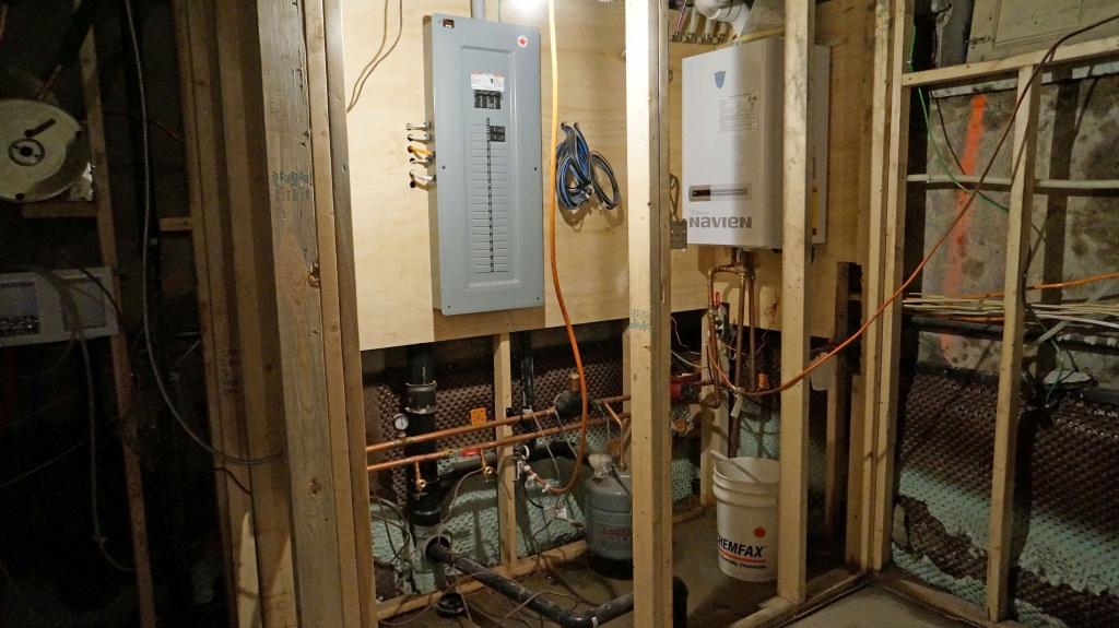
Plumbing Innovation
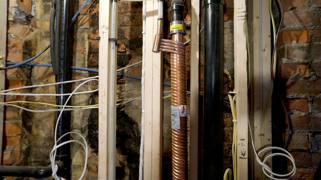
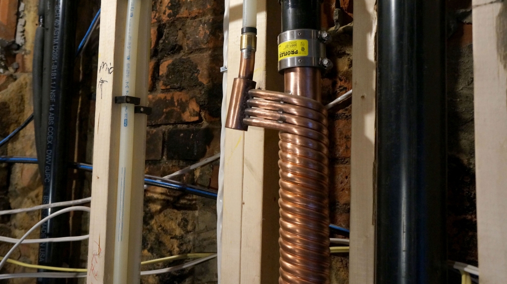
The coolest part of our plumbing system is our drain water heat recovery unit. We’re using a new technology called Power-Pipe®, designed and manufactured by RenewABILITY in Kitchener, Ontario. Power-Pipe® uses gravity and the physical properties of water molecules to capture a large amount of heat still latent in household drain water, particularly from shower drains.
The Power-Pipe® design takes advantage of the way in which water actually travels through a tube: rather than shooting straight down the middle, water clings to the tube wall. This creates a thin film of water over the entire inner surface area of the tube, making most of the latent heat accessible for recovery and “reuse”.
The tube through which the drain water travels is then wrapped with copper piping that circulates incoming cold water around the entire outer surface area. Water that passes through the copper piping is then effectively put in contact with the hot outgoing drain water, and that contact is all that’s needed to transfer the heat to the cold water. In this way, incoming water is tempered, or pre-heated, before it reaches the water heater where now less energy is required to bring it to temperature.
“A 60-inch Power-Pipe System, for example, can raise the cold water temperature from 10°C (50°F) to as much as 24°C (75°F), under equal flow conditions.” – RenewABILITY Energy Inc.
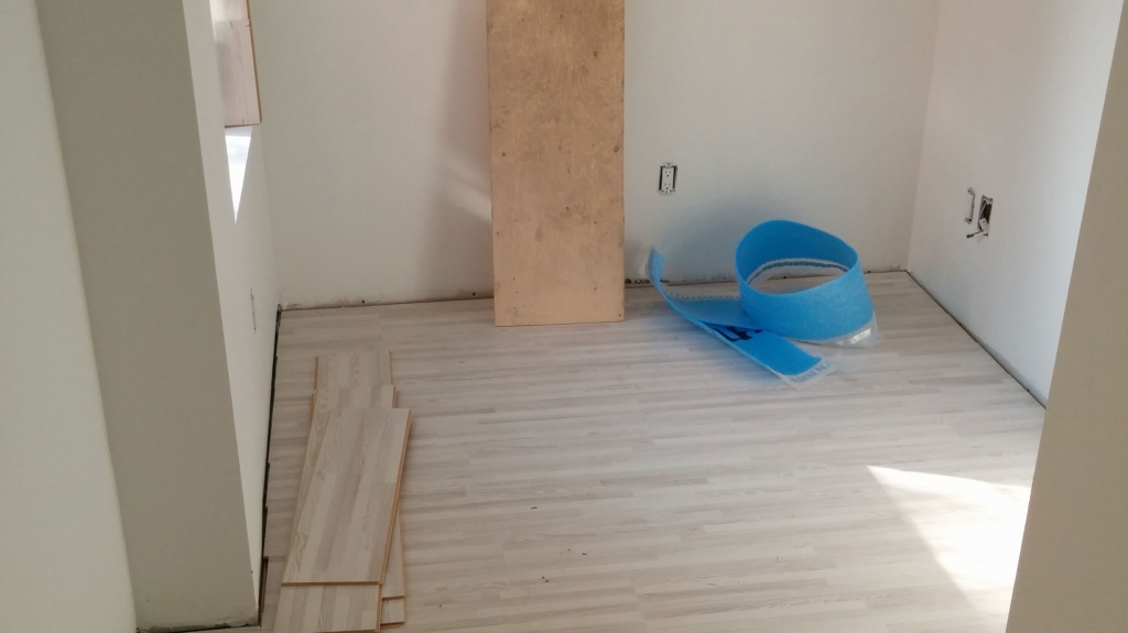
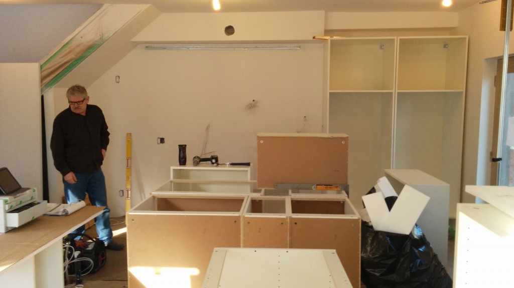
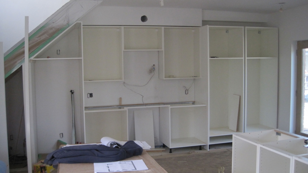
It’s happening, people! We’ve actually moved in already, but we’re going to keep you in suspense while we catch up and tell you about the interiors. You’ll have to wait just a little longer for the big reveal! The interiors went really well, especially thanks to Paul Drumonde of Modern Dwellings, who we hired to take on managing the details and to shepherd our home through its final stages. We couldn’t be happier with how he did! Both our two floors and the lower level rental suite had all the fittings installed: flooring, paint, trim, counters, cabinets, stairs, bathroom, kitchen, lighting, etc. Here’s the low-down: Flooring: Laminate flooring by Torlys, with White Ash finish – we love how calm and bright it feels. In our bathrooms we have tiles and mosaics from Olympia Tile. Paint: All white and bright! Benjamin Moore’s “Chantilly Lace” (OC-65). We love this white. Painting was done beautifully by Trevor Wallace and Dax Lough of The Painting Hub. Countertops: Custom-made, local oak countertops by Willinsky Design. We love the natural feel, and the way they bring colour and warmth to the space. Cabinetry: IKEA! Yes, IKEA is great for quality, affordable, formaldehyde-free cabinetry. Custom cabinetry can really add a lot to a budget, so the money we saved here we put into energy efficiency. We chose their Applad line of cabinetry. Kitchen: All our appliances were also from IKEA. Bathroom: Our toilets are high-efficiency flush toilets by Toto, and we have low-flow faucets and showerheads by American Standard. Lighting: The pot lights over the stairs are LED, and the rest of the pot lighting is halogen for the quality of light they provide. The pendant lights in the kitchen and bedrooms are from IKEA. Stairs: Our mirrors and the amazing glass stair guard are by Shower Deluxe. Our daughter loves sitting at the top of the stairs and waving at us through the glass! Window Coverings: All our blinds are from Home Depot. We are thrilled with the outcome, and can’t wait to show you the final reveal once we’re fully settled in. Hopefully we can keep the kids from drawing on our lovely white walls… but even if they do (or especially), we’ll be all the more at home!Interiors!Go To Project Page
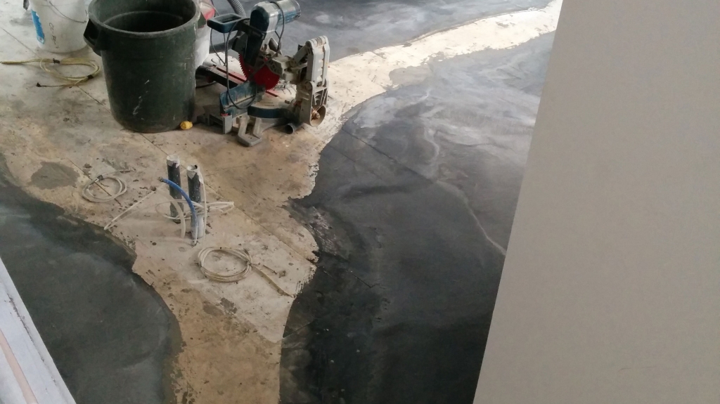
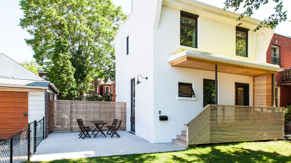
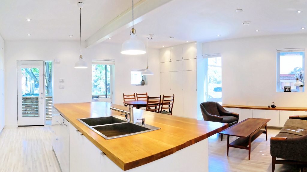
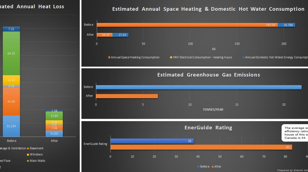
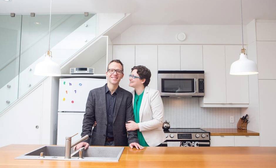
9 months and $325,000 later, it’s time for the big reveal! And with an 84% reduction in energy use, we couldn’t be happier. Thanks for sharing the ride with us. Our house is complete and brings us joy every day. The big news is that we’ve achieved an incredible 84% reduction in energy use, and a final air leakage rate of 2.08 ACH – that’s a LEED Platinum level, and represents a CO2 emissions reduction of about 15 tonnes! We’ve been so comfortable on hot, muggy days without any air conditioning. We just open our big, beautiful windows and skylight and voila! … cool, breezy interiors. On cooler nights we simply close up and enjoy a warm and cozy sleep. Our open main floor has been a pleasure for us and the kids. We can all be doing our own thing while sharing space in the various zones of the room. The white interiors and plentiful windows make our home feel large and fresh, even though our two floors are each only 450 sq.ft. We love our yard, with space for outdoor dining and for the kids to play. Our landscaping and cedar porch were done beautifully by r.environs inc. and Pro ICF, respectively. The chain link fence is a rare original – just about the only thing we kept! We hope you’ve enjoyed this journey with us as much as we have. Thanks for reading along as we designed and built our own Solares home. Here’s a recap of the last 9 months: 1 happy family FINALLY living in a Solares house!The Big RevealGo To Project Page
Media Coverage!
Our House was featured in the Globe and Mail! It’s a fabulous piece on our deep energy retrofit and the process we took to get there. It was written by the amazing Dave LeBlanc, the Globe & Mail’s Architourist – he came by for a tour of our home! His article is online now, and will be in the paper edition tomorrow, October 31st.
It’s so wonderful to be living in the house now and receiving this wonderful feedback. Feeling grateful every day. Thanks to all of you for following with us on this incredible journey!
- + Intro
- We’re building our own home!
Have you ever wondered what it’s like when architects build their own homes? Well, now’s your chance to find out – Tom and I have bought a fixer-upper in Roncesvalles!
Last week, we closed the deal on a small detached brick box in Toronto’s Roncesvalles neighbourhood. As green home designers we’re going to renovate it from top to bottom and make it as energy efficient and sustainable as we can possibly afford. Promoting energy-efficient design is something we do all day, every day, and yet our current apartment is leaky and uncomfortable. Now we have the chance to join our rank of fabulous clients who live in Solares houses!
On this blog, I’ll be telling the story of our progress as we immerse ourselves in the same process through which we lead our clients. We’ll experience what they experience, including all the visioning homework, decision-making, spending and anticipation. For us, this is a chance to put our money where our mouths are and build ourselves a beautiful, environmentally integrated home that meets our needs and budget.
I’ll be blogging here from the early stages of the design process, through the challenges of permitting and the ups and down of construction, until the exhilarating moment of moving in. I’ll explain how we make our decisions – particularly around sustainable house design, products and practices – and how we balance our strong sustainability principles with the inevitable reality of affordability. It’s going to be interesting, folks.
We’re going to find out what it’s really like to build your own custom home, to work with an architect (ourselves!), and to spend huge amounts of money. We’ve seen it from the other side countless times. Now it’s our turn, and we can’t wait to share our journey with you! - Christine
Go To Project Page


 The House
We now have ourselves a detached solid brick house on a square lot along a quiet, leafy street. It’s very close to family, schools and parks, and just a 15 minute walk from our office! We’ll be drawing on our decade of sustainable house design experience as we do this – our own – major renovation and landscaping project.
The house has two floors, an unfinished basement, and an enclosed front porch. The building needs A LOT of work, so this will be a full gut renovation job and we can’t wait to sink our teeth into it! Our goal for the house is to have both our own 3-bedroom family home and a basement apartment for rental income. We’ll add a separate exterior entrance to the basement, enabling us to create an independent, self-contained apartment.
The site itself is fairly unconventional, with a moderately sized yard that wraps around the front and side of the house. The other two walls of the house sit directly on the property line which means we have no “back” yard in the traditional sense. A neighbourhood laneway borders the side of the detached garage. A short walk away is the amazing Columbus parkette with a brand-new play structure, splash pad and large shade trees.
The Stats
Lot size: 1,685 sq.ft.
Building footprint: 625 sq.ft.
Total floor area for all three levels: 1,875 sq.ft.
Total finished area of our home on the upper two floors: 900 sq.ft.
Total finished area of the lower level rental suite: 400 sq.ft. - + Design
- Designing Our House
The first big task of the Solares process is to do our Client Homework which sets the stage for the design. Through this exercise, each of us explores the way we live now and the values we want to instil in our new home. We’ve read our clients’ Homework exercises countless times – now it’s our chance to make sure the dog doesn’t eat it… Who am I kidding? I love Homework!
When we do this with our clients, we ask each member of the family to do the assignment individually in order for us to capture everyone’s ideas and values. Our kids are still too young, so they’re off the hook! Later in the design process we’ll merge the diverse Homework results into one guiding vision so everyone’s thoughts and dreams are included.
The first part of the Homework is to gather images we are drawn to, pictures of homes, products and materials that we love. The images above show the products, feel and aesthetic that Tom and I would love to incorporate in our new home design. They show our thoughts around environmental sustainability choices, lifestyle, connection with the outdoors and materiality.
The second part of the Homework is to write our vision for an ideal day we would like to have in our new home five years from now. This helps us design a home that can accommodate the little things in life and to support the daily flow of our future visions. It felt daunting at first, but once we let our imaginations flow, it became really fun. I’m going to go out on a limb and share my “Day in the Life” with you!
A Day in the Life
Today is my 40th birthday. I wake and watch the golden sun slowly creep along the wall of our bedroom. Tom, who has been up since 6am for his daily run, comes in with a cup of tea and the crossword then heads off to shower and shave. I have fifteen blissful minutes alone with my tea, my puzzle and my golden sunshine. Just as Tom comes back into the bedroom my parents call to sing Happy Birthday. The kids hear the phone ring, come running in and jump under the covers on either side of me. I wrap my arms around them and we talk about our current favourite subject: our upcoming trip to Italy, my 40th birthday gift, which Tom and I have been saving for since his 40th birthday three years ago.
Downstairs, there is a huge bouquet of flowers sitting on the island, a yearly treat from Tom. He makes breakfast while the kids and I read books on the sofa. The sun coming in the window feels hot on our backs. Outside the lilac bush is in full bloom.
After breakfast Tom takes the kids to soccer practice and I spend an hour pottering around the house: tidying, showering then getting dressed. Julia and Sarah and I meet up lunch on Roncesvalles. We happily snag a table in the shade and treat ourselves with a bottle of chilled prosecco. After lunch I meet up with Tom and the kids and we wander down Roncesvalles buying last minute provisions for tonight’s party.
Nick and Julia have agreed to take the kids swimming so we can finish our preparations so we drop them off and wander back home with our shopping bags. Before launching into party set-up mode, we enjoy a quiet cup of tea and the newspaper. We set up food, drinks, music, games and lighting then pop upstairs to change into our party clothes. We have just enough time to wander around the garden looking at the flowers with a cold glass of white wine before we see Nick, Julia, Sarah, Peter and all the kids coming up the road. Soon the entire house and yard is full of friends, family and neighbours chatting, laughing, eating and drinking. Kids run wild and Tom is pulling pizza after pizza out of the oven.
Just after the sun sets, Julia comes out of the house with a huge birthday cake ablaze with candles and everyone erupts into song. After the last cake crumbs have been eaten and all the guests leave, we tuck the kids into bed upstairs, gather around the dining table with our closest friends and talk, talk, talk late into the night. – Christine
Go To Project Page


The Floor PlansThe footprint of the house is 625sf per level. Once we take into account the 8” thick brick walls then the 6” of insulation we are adding to the interior perimeter we have 450sf of living space per level. That’s pretty small! We need to squeeze every inch out of the design to accommodate our needs.
In order to maximize the space of the house and yard we are proposing to move the front porch to the north western corner. A former window will be enlarged to accommodate the front door. From the porch you will walk directly into one big room which houses the front entry, kitchen, dining room and living room. The front entry will have a large closet that will blend seamlessly with kitchen cabinetry along the west wall. The kitchen will have a large island perfect for food prep, light meals and entertaining. The living and dining spaces will encompass the east side of the house with windows on the north, east and south. We will be cutting two huge openings in the brick walls to let in tons of natural light.
In the small bump around the back of the house we will have an ultra-compact stair and two-piece washroom. Upstairs will be three small bedrooms and a large family bathroom with laundry. We are carefully locating each bedroom to coincide with existing window openings. A couple of skylights will flood the dark spaces with light.
The basement will have a separate exterior entrance in the small bump-in area behind the house. The compact 400sf unit will have an open-concept kitchen, dining, living room, a bedroom with full-height window and long closet, a bathroom with laundry and a small mechanical room that will house the boiler, HRV, sump pit and grey-water treatment system.
The house is small but we feel the design really suits our lifestyle and budget. A lot of people have suggested that we add a third story but it’s just not in the cards for us at this stage. When we outgrow this house, we’ll just have to build another one!
The Energy AuditWhile not mandatory, for major renovation projects we always recommend doing a home energy audit. By testing the energy efficiency of our house before construction, we know where to focus our efforts and we have a baseline against which we can measure our success. Our own home is a chance for us to push the boundaries of budget-conscious energy efficient design, so with this baseline we can see the effectiveness of our implementation.
We use Blue Green Group for all our energy audits and performance testing. We highly recommend them because they conduct the initial audit and advise on energy efficiency construction strategies. They also do blower door tests during construction to test the effectiveness of the air barrier. Each blower door test costs about $300, and we think that’s money extremely well spent – once the house is finished it’s too late to fix the air barrier! Upon completion they conduct a final audit to tell us how well we’ve improved the home’s energy efficiency.
The existing EnerGuide rating for our house is 38. That’s lower than the Canadian average of 44 for houses of the same age. For us this is exciting news because it give us so much potential for energy upgrades! With attention to insulation, mechanical systems and reducing air leakage, we are aiming to reach an EnerGuide rating of 82. This would result in nearly an 83% reduction in energy consumption!
While most new-build Solares projects reach EnerGuide 87-88, our house presents some unique challenges to attaining that rating level: Our site has limited solar exposure, which reduces our capacity to use the full gamut of passive solar design techniques. There are also limits on insulation and air sealing in a retrofit situation such as ours. Our dream would be to reach a 90% energy use reduction, but we’ve decided to keep our eye aimed on a challenging yet realistic target.
The results of our initial blower door test shows a baseline air leakage rate of 7.72 air changes per hour (ACH). ACH refers to the number of times that the total volume of air in the home is replaced by new air from outside through the process of air leakage. A house with a high ACH value will require more energy for heating and cooling, since it will need to temper new air more frequently. And while it’s true that older, leaky houses don’t require mechanical ventilation, they certainly consume a lot more energy for heating and cooling!
For our house, we’re aiming for 2.0 ACH, a huge reduction from the original 7.72. We will be providing fresh air with a top-of-the-line ERV (Energy Recovery Ventilator), so we’ll be keeping Tom’s favourite motto in mind: “Seal it tight, ventilate it right!”


 Pre-Construction Must-Dos
We have our house, we’re ready to renovate… what do we do first? Like any major investment you do your due diligence, right? Here are two major pre-construction “must-dos”
(1) Get an official building permit from the local authorities. Having an official building permit is important for life safety (during and after construction), labour laws, zoning bylaws, and resale. Basically, it’s about making sure you’re legally covered and that everyone is safe.
You need to give yourself a lot of time for the approval process. Since we want to keep this project moving swiftly, we decided to approval-proof our application by avoiding certain things that could prompt extended review – things like a large addition that would encroach into setbacks, a new third storey that would add square footage, or construction within the tree protection zone at the front of the property.
Our application is in, including all the required paperwork and detailed drawings. Until we get our approval we can’t do any major construction. However, while we wait we can do a full interior demo and strip-out so things are ready to go as soon as we have our permits in hand!
(2) Conduct a soil test. Testing the soil is very important for locating the water table and for understanding the soil’s stability and bearing capacity. Basically, how deep and how much can you build? This all relates to building height, basement depths, whether or not you can add an addition, and designing the right foundations.
A soil test starts with digging a hole. We decided to dig it right and dig it deep – ours went down five feet! We hired Soiltest Services Ltd to dig the hole and inspect the soil striation to see what’s layered under the house. They look for things like a “hidden” layer of unstable soil below otherwise stable layers, as well as other things that could impact design decisions and cause construction delays.
We are happy to report that not only is our hole perfectly dry, but the test showed a single, solid layer of pure, silty sand. This means we’re good to go with no need for remediation or design changes! This was truly the BEST $750 “wasted” – investing in a test that shows no problems is the ideal result!
- + Structure
- Demolition
We’re finally getting our hands dirty with the demolition phase! We’ve now finished the process of stripping the house of everything interior, from floor to ceiling, as well as opening up the enclosed front porch. For now, we’ve left the central framing as is since there are load-bearing walls that will need more specific attention during the heavy framing stage – stay tuned!
Limiting waste and reducing fuel usage is very important to us, so our whole team took care to strip things down neatly and pack everything carefully into a single dumpster. That’s right, we only filled one big dumpster for the entire demolition process! Typically, major renovation demolition for a home can fill dozens of dumpsters, adding cost to the project and burning more fuel to transport each one to landfill. We also found new uses for reusable items – for example, one of our new neighbours took all the interior doors to repurpose as a room divider for an interior design project.
Stripping a house can illuminate more information about the house you’ve bought, and ours was no exception. We found a giant wasps’ nest inside the flat roof ceiling, which would have lurked there for many more years had we not opened things up! While doing a full strip-out can increase the overall budget, we are very happy to have a thorough and fresh start with this old Toronto house. The cost for us is simply part of the project and not an extra.
What’s more, it’s often the less fancy interventions that make a huge difference. The removal of the front porch enclosure alone had many neighbours remarking on how much they love the new look of the house! We’re happy with it too, and feel excited to now be working with a bright, open canvas – after demolition it feels like things are really moving!
Go To Project Page


 Heavy Framing
Now that we’re finished with the strip out and demolition, we finally get to remove those load-bearing walls to open up the space! Load-bearing walls can only come down concurrent with installing new load-bearing beams in their place. In our case, we’re using beautiful 10” steel beams sourced by our framing contractor.
On the main floor we’ve decided to locate the beam below the ceiling so that it becomes an interior design element, whereas in the basement we’re putting it flush with the ceiling for maximum ceiling height. On the second floor we decided to keep the interior load-bearing wall in place, since we want to maintain the division of space for the bedrooms and bathroom anyway. This one bit of wall will be the only original interior wall remaining.
The process for installing the beams is very clever: shoring is built on either side of the load-bearing wall to support the structure above while the builder installs the beam. Shoring is essentially a temporary prop that prevents a structure from collapsing until the main supports are in place. In this case, this is done with two makeshift walls placed on either side of each load-bearing wall to be removed. Once the shoring is in place, they remove the load-bearing wall and install the new beam in its place. Lastly, the shoring is removed and voila – open space!
In addition to removing the basement and ground floor load-bearing walls, we’re relocating the stairs. On the ground floor, we felt that the existing stair location in the north-east corner is actually the nicest corner of the house! In order to use that spot for living space, we’ve moved the main stair to the south-west rear corner and have reframed the floors to accommodate the new location.
We have also committed to creating a separate rental unit in the basement by moving the basement stairs to the outside. This gives us storage space under our own interior staircase, and provides our future tenant direct, private access to their apartment. For our purposes, we will only need access to the basement mechanical room for infrequent maintenance. Moving the basement stairs required new underpinning and concrete work to create the stairwell and landing space.
The new beams are in, the stairs are relocated, and the place feels bright and airy. The beam on the main floor is a beautiful design element that acts as a gentle, permeable zone divider. And – we will officially be landlords for a new rental suite!
Foundation UnderpinningThe next major structural stage is the gloriously messy job of underpinning! Underpinning the foundation allows us to create a nice, high ceiling for the lower level apartment by lowering the foundations and basement floor slab. The process is very specialized and must be done carefully and methodically by underpinning specialists.
Generally speaking, underpinning is done by digging out the soil from under the existing footings to the new desired depth and then filling that space with new concrete – in small sections at a time to prevent collapse! In order to fill the cavity completely, the typical method ends up with extra wall thickness up to the fill line, decreasing the square footage of the basement. For our house, however, we’re using a different technique that allows for the added footing depth to be fully flush with the existing foundation walls. We love this technique because we don’t lose any of our precious floor space, and it’s less labour-intensive and therefore less costly than other flush-wall techniques. Besides, it’s so very clever! The method uses a keyhole system above the pour zone, which is quick and easy to fill with grout after the new concrete has cured. We’re working with the experts at Tall Basements who have streamlined the process and have even tailor-made their tools and formwork specifically for this technique.
As well as maximizing the floor space for the tenant suite, the underpinning will create a ceiling height that far exceeds the Ontario Building Code’s minimum requirement. The Code requires a minimum ceiling height of 6’-7” in basement suites and ours will be 8’-6”! When we committed to a rental suite in the first place, we also committed to creating a bright, beautiful space that will allow us to seek a higher rental fee and increase the chance that the tenant will stay for the long term. It’s not only pragmatic from a financial standpoint, but it’s also important to us that whoever lives under our roof feels happy and healthy in their home.
At the same time as underpinning the basement, we’re adding a new exterior stair for direct access to the new tenant suite. When we did the heavy framing we removed the interior basement stair in favour of having a private outdoor entrance for our future tenant.
We’re excited about the new tenant suite taking shape! Let us know if you have any questions about the underpinning technique we’re using. We’ll be happy to get into the details!


Update: New Floor Plans!We’ve redesigned the floor plans! In every project, we want to be responsive to the process and as nimble as possible. The critique of our work doesn’t stop until we have the best possible design! In the case of our house, we realized post demo that with some key changes to our initial floor plan layouts we could improve the beauty and usability of all three floors. After giving it careful consideration – to make sure the changes were feasible – we decided to go for it! Here’s the breakdown, by floor level:
Main Floor: In the first layout, in order to fit the stairs in that location, we had a rather treacherous series of steps, with angled winders and treads that only just met building code minimum depths. The top of the stairs over the kitchen island presented limited headroom and created a feeling of division between the kitchen and living room. The amount of new window openings was very expensive. The new floor plan shifts the stairs to the south-west corner, allowing us to extend the length of the stair and normalize the runs and treads. The powder room has shifted to where the stair used to be, giving it access to the east window. The space under the stair will house the fridge and a sorely needed “broom closet”. We scaled back the new window openings and put that budget towards other things. We are still enlarging some windows, but to a smaller extent, and are only adding one new, modest-size opening to match the other windows.
Second Floor: The initial layout was informed by the location of the main stair, with all rooms opening directly onto the top landing, lit overhead by a skylight. The main bathroom was spacious and lit with a second skylight. The two main bedrooms for us and our kids were at the front of the house, with a third room designated as a spare room and study. In the new plant, the updated location of the main stairway makes the second floor layout easier to resolve! By repositioning the top stair landing all the way to the west wall we were able to design a more hall-style circulation area, and create more appropriate room sizes and locations. And the bathroom now has an operable window for natural ventilation! We also saved cost by cutting down to just one skylight.
Little did we know when we first designed the layout that during demolition we’d discover a beautiful, vaulted ceiling at the front of the house! In the new layout we’ve designed the playroom to take advantage of the fabulous 12’ ceiling height. The bathroom has a flat ceiling to create an attic-like space above for storage and for the location of our ERV.
Lower Level: Originally, the entrance to the rental suite opened onto the living room, with the bedroom on the left in the south-west, and the dining area, kitchen and bathroom beyond. The kitchen lay across a single-wall with space for a dining table next to it. The bathroom opened onto our mechanical room on the north side. Overall, we opened many of the windows to bring in lots of light, and made a new opening next to the door for a large, south-facing window onto the living room.
In the new layout, the entrance opens onto the space between the kitchen and the living-dining room. This makes the entrance zone more usable for arrivals and creates space for a larger, galley-style kitchen with more counter space. With the kitchen at the entrance, the new window opening at the door combined with an east-facing window means the kitchen will be brightly lit throughout the day. The living-dining room now occupies its own zone in the south-west corner with no doors coming off of it, thereby maximizing the usability of the space.
The bedroom is now in the north-east corner of the suite, with more space around the bed and direct access to the bathroom. We moved the bathroom away from the public zones of the suite for privacy, and it now has the north window that was previously in the mechanical room. We made the mechanical room a smaller, closet-style space, since the energy-efficiency of our house requires only small-scale mechanical equipment. Overall, we increased the floor area of the apartment, brought more light to more spaces, improved the circulation and created a more usable kitchen!
- + Envelope
- The Roof
The roofing solution for our house is something we’re particularly excited about. We’re taking a less conventional approach that will give us a very long-lasting roof, contribute to a durable, well-sealed and well insulated building enclosure, and offer us flexibility with lighting design and other ceiling penetrations.
The big idea was born at a Roxul seminar where I ran into our former professor John Straube. John is a brilliant building scientist, so I (politely) cornered him with ideas for our roof! Together we hashed out an innovative design that uses a more commercial-style approach. I brought the idea to our roofer, Mike Beauchemin of Eco-Tech Roofing, and together we further developed our roofing strategy. Eco-Tech specializes in interesting, alternative approaches to roofing.
The first reason we’re not doing a typical residential roof is that we have a mostly flat roof with only a small peaked area at the front. The typical residential, insulated, attic-style roof uses batt insulation in the ceiling with a 6 mil poly inside to create a combined vapour and air barrier. Most importantly, the top of the insulation is ventilated. While this roof-type can work well, it is very difficult to seal properly because the air barrier layer often gets punctured by things like lights, walls and pipes. Our roof, however, puts that air barrier outside of the building and is more like a commercial roof. This gives us a better air barrier, more insulation, and more internal space under the small peaked area at the front of the house.
Here’s a break-down of the assembly, from outside to inside:
Exterior Roofing Product (outermost layer). We’re using Duro-Last roof membrane for the outermost layer, which is a product more typical of commercial roofs. It’s a white, “cool roof” product that reflects the sun’s heat, which reduces air conditioning loads in the summer. This means we’ll have less heat gain in the summer because the majority of the sun’s heat bounces off of the light-coloured roof – this high solar reflectance is known as a high albedo rating. This also reduces the overall strain placed on the roof, with means the product will last much longer than darker alternatives. Duro-Last is applied in sheets that are rolled out and essentially welded together with an iron to form a continual layer. It’s a bit like a swimming pool, leaving no way for water to penetrate.
Rigid Insulation. Just under the waterproof roof membrane are two layers of 3-inch rigid polyisocyanurate insulation (polyiso) placed with staggered joints. With an insulation value of R6.5 per inch, this layer contributes R-39 to the assembly, exceeding the building code standard of 33 for residential flat roofs.
Air Control Layer. This seemingly small item is the most important part of the roof assembly. It’s a peel and stick waterproof membrane – in this case we’re using a combination of Blueskin and Grace Ice & Water Shield. The purpose of this layer is to create a continuous, air-tight layer that connects across the roof as well as to the air-tight layer in the walls (in this case a closed-cell, spray-foam insulation). This approach creates an air-tight seal because the wood decking is covered on both sides, with the membrane on the top and the spray-foam on the bottom along the entire perimeter. The combination of the Blueskin and Grace products also provides us with another waterproof layer – as soon as it was installed, the house was water tight!
Wood Decking. Next in the assembly is the wood decking. We replaced sections of the original decking that were rotting with thicker plywood, and then covered the entire roof with an added layer of thin plywood to create a uniform finish.
Interior Insulation (we’re now officially inside the building). Since we have high-levels of insulation on the outside, as well as an air barrier, we only need an inexpensive, loose-fill insulation on the inside. We’re still assessing the option of using a low-density, water-based, spray-foam product like Icenyne; otherwise we’ll go with a cellulose or batt alternative. Whichever we choose, it will need to fit perfectly within the cavity so there are no air spaces. The insulation value of this layer will average across the roof to about R-27. With the exterior polyiso already exceeding code, this layer makes the roof really out-insulate the provincial standard – a practice we aim for with all our projects!
Vapour Control Layer & Ceiling (inner most layer). Instead of plastic sheathing, our vapour control layer will be a simple primer product applied to the interior of the ceiling drywall. Benjamin Moore’s Super Spec™ line includes a low-permeability latex vapour barrier primer, which essentially means that humidity won’t be able to penetrate through to the inside of the roof assembly, preventing the build-up of mould and mildew. This does not have to be very strong, because we have a consistent air barrier above; this layer only needs to prevent the relatively weak moisture drives of the interior from entering the enclosure.
In total, our roof assembly has an extremely high insulation value of R-66, which is about double the requirement for a residential flat roof. More importantly, it’s a vital part of our air-tightness strategy, since we are trying to meet or exceed the super-low level of less than one air change per hour during a blower-door test (that’s 1.0 ACH @ pa50).
One of the downsides of this roof is the cost of the membrane and the additional framing required to accommodate the thicker roof profile. However, we’re hoping that cost is offset over the years, since it should have a lifespan much longer than a typical asphaltic flat roof. In fact, our roofer has assured me that I’ll retire with the same roof!
The roof is coming together quickly and with high-quality installation. Building our own home means we get to design solutions we’ve always wanted to try, and this residential roof innovation is a great example.
Go To Project Page


 Framing’s Complete, Windows are In.
All the framing is now complete, and the main staircase is fully installed. We framed the outer walls with 2×4-inch studs placed every 24 inches, instead of the usual 16 inches. We also offset the studs a minimum of 1” from the face of the brick. With these two strategies, we can spray more insulation between and behind the studs, which helps reduce thermal bridging. By reducing the number of conductive spots, we’ve increased the overall effectiveness of our insulation.
We originally wanted to use small 2×3-inch studs and use the extra inch for even more insulation, however the normal wood stud at that size is terrible for twisting and warping. We did try to source finger-jointed 2×3 studs, which are much stiffer and more stable, but they were impossible to find! If you know where to get 2×3 finger-jointed studs we’d love to hear from you!!
And, the windows are in! We like lots of light, so not only did we design our house with lots of windows but we also opened two large holes in the brick at the back of the house to make space for big, south-facing windows – one on the ground floor for our living space, and one on the lower level for the rental suite. These windows will help us take advantage of passive solar heat gain in winter, while in summer they’ll be shaded by the large, leafy trees in our neighbour’s backyard! All of our windows are triple-glazed fibreglass units from Fibertec.
Upstairs, we have a skylight over the staircase, and will be installing a solar tube over the hall outside the bedrooms. The skylight is an operable, triple-glazed unit from Allied Plastics, run by an electrical motor controlled at a wall switch. We love the skylight not only for the light and ventilation it provides, but for the views it gives of the sky and nearby trees. In order to limit associated heat gain/loss, we’ll be dressing it with a thermal, black-out blind from Hunter Douglas, also controlled at a wall switch. The blind will help keep the heat in on cold winter nights and out on hot summer days.
We’re also installing a solar tube by Solatube above the upstairs hall. Essentially, a solar tube captures daylight and channels it down through a highly reflective tube to significantly brighten an otherwise dark space. This means that during the day we won’t need to turn on any lights at the top of the stairs! The tube’s diameter is only about 10 to 14 inches, but its inner surface is so reflective that it can bring in an enormous amount of sunlight through a tube as long as 20 to 30 feet! With limited outside surface area, the tube doesn’t contribute to summer heat gain or winter heat loss – it only transports light, not heat!
Seal It Tight, Insulated It RightOur house is going to be an extremely well insulated and energy efficient home!
We’ve focused on high insulation levels in both the walls and the ceiling, and a well-sealed envelope. Our wall framing uses 2×4-inch studs placed every 24 inches, and our ceiling is part of a more commercial-type roof assembly unique for a residential project.
In our walls, we’re using 4 inches of a water-based closed-cell 2-lb polyurethane spray-in-place foam insulation by Icynene, installed by CallRich Eco Services. With an insulation value of R6.75 per inch, that gives us R27 in the walls.
Between the rafters in the ceiling we installed an open-cell 1/2-lb insulation, also a polyurethane spray-in-place foam product by Icynene installed by CallRich. We’ve used 1/2 lb in the ceiling because we already have an air barrier above the roof structure (the roofing membrane on top of the sheathing), and above that we have 6” of polyisocyanurate board insulation. We wanted a vapour-open product between the rafters in order to prevent creating a “vapour sandwich”, which could trap moisture in the roof structure and lead to rot.
Once the insulation was in, we put our air barrier to the test before starting any drywall. Shervin from Bluegreen Group went around with infrared cameras looking for all leaks and “micro” leaks in the entire building envelope. We marked them out, and over the course of two days went back and sealed each one with acoustical sealant.
Acoustical sealant is perfect for sealing air leaks because it never really dries. It remains somewhat viscous, allowing it to flex and continually do its job even with shifts in the framing during seasonal temperature and humidity changes. In the industry it’s commonly known as “The Black Death” – its colour is black, and it’s extremely sticky and difficult to get off your hands! But in spite of that, it sure does work.
After fixing the leaks we did an official pre-drywall air leakage test, which revealed an air leakage rate of 2.74 ACH@50PA. That’s a 65% reduction from the pre-retrofit tests. Now that we’ve patched all the hard-to-find leaks, the final test results will be even lower! We’ll be testing again after completion to determine our final air leakage result and our overall energy efficiency rating.


- + Systems
- HVAC Innovation
HVAC is the acronym for Heating, Ventilation and Air Conditioning – essentially, all things related to indoor comfort. It is commonplace that these systems are oversized in residential projects, ironically leading to inefficiencies even when using efficient equipment. For our HVAC system we went with a more innovative design process, which enabled us to size the systems for the exact design of our house. This means that every bit of energy that goes into running our system gets “used”. There will be no wasted energy in our house!
Often, mechanical designers over-size the systems because they infer a heat loss calculation based on the size of the house, rather than doing accurate calculations based on a home’s specific design (i.e. building orientation, insulation and air tightness). For Our House, our mechanical designers custom and accurate heat loss calculations, enabling them to size the systems exactly to the design of the building. They then ensure the efficiency by installing the system exactly to their design. With this approach, we benefit with an HVAC system that’s not only extremely energy efficient, but also at a lower cost by being no larger than needed.
This design-build approach involved (1) the in-floor heating system; (2) the small combination boiler in the basement; (3) the fresh air and ventilation system; and (4) a ducted “ductless” air conditioning system:
- In-floor heating: For our living space we’re using an in-floor hydronic heating system with tubes installed between the floor joists. While it’s rare to have in-floor heating in a wood-frame floor without a concrete topping, it actually brings us significant cost savings in the range of $7-8,000 for our house without compromising comfort or efficiency. While a concrete topping is nice, in our case it’s more of a luxury upgrade because our heating loads are so small that the difference would be barely noticeable. (For new-builds or larger homes, concrete is nice because it evenly distributes the heating and stores energy to be released slowly over time, otherwise known as thermal mass effect.) In the lower rental suite, the in-floor heating is embedded into the already concrete floor slab.
- Combination boiler: The in-floor hydronic heating tubes are tied to an extremely small boiler in the basement, which services the heating tubes and all the domestic hot water. This “combination” boiler by Navian can produce water at two different temperatures, as the in-floor heating system doesn’t need the same level of heat as domestic hot water. That might seem counterintuitive, but actually in-floor heating only requires a gentle heat, as it’s predicated on a “slow-and-steady approach”. The boiler is the smallest available unit – about the size of a small backpack – as we don’t need anything larger with our extremely efficient building envelope. By investing in insulation, air tightness and good windows, we get a super comfortable home and we save on HVAC equipment!
- Fresh air and ventilation: Fresh air and ventilation are provided with two Energy Recovery Ventilator units (ERVs), one for each dwelling unit. The ERV for our space is located on the second floor in the small bit of attic space we’ve kept above the bathroom. The other ERV is located in the lower level mechanical room and is dedicated entirely to the ventilation and air quality of the rental suite. ERVs do basic fresh air ventilation while transferring heat and humidity from the outgoing stale air to the incoming fresh air, reducing the energy required to bring the incoming air to temperature and increasing comfort levels in our dry winters and muggy summers. The ERV ducts are smaller than conventional forced air ducts, at only four to six inches in diameter. At this size they can fit inside the regular partition walls, eliminating the need for bulkheads that increase cost and cut into the space. The slow-moving air from the ERVs create a steady, gentle and quiet flow of air – much quieter than conventional forced air systems!
- Air conditioning: You know those ductless mini-split air conditioners, those horizontal louvered units you see high up in a room? Well, we’re ducting a ductless mini-split! We’re already installing small diameter ducts for our ERV ventilation system, so we’re tying a ductless mini-split into the same network. Typically, mini-splits are on a per room basis and blow chilled air into a room from one spot, creating an uneven distribution of air. By tying it into our ducts, we can drop cool air more consistently through each room, and we’re piggy-packing on the money we’re already spending for the smaller, economical ERV ductwork. By integrating our chilled air into the ERV’s fresh air delivery system, we have a unified, consistent and quiet air delivery system for both heat and air conditioning. With our system we get the best of both worlds: it’s quieter and more streamlined than a central system, and it’s customizable for more efficient distribution through small ducts that don’t require bulkheads.
Go To Project Page


 Plumbing Innovation
The coolest part of our plumbing system is our drain water heat recovery unit. We’re using a new technology called Power-Pipe®, designed and manufactured by RenewABILITY in Kitchener, Ontario. Power-Pipe® uses gravity and the physical properties of water molecules to capture a large amount of heat still latent in household drain water, particularly from shower drains.
The Power-Pipe® design takes advantage of the way in which water actually travels through a tube: rather than shooting straight down the middle, water clings to the tube wall. This creates a thin film of water over the entire inner surface area of the tube, making most of the latent heat accessible for recovery and “reuse”.
The tube through which the drain water travels is then wrapped with copper piping that circulates incoming cold water around the entire outer surface area. Water that passes through the copper piping is then effectively put in contact with the hot outgoing drain water, and that contact is all that’s needed to transfer the heat to the cold water. In this way, incoming water is tempered, or pre-heated, before it reaches the water heater where now less energy is required to bring it to temperature.
“A 60-inch Power-Pipe System, for example, can raise the cold water temperature from 10°C (50°F) to as much as 24°C (75°F), under equal flow conditions.” – RenewABILITY Energy Inc.
- + Interiors
- Interiors!
It’s happening, people! We’ve actually moved in already, but we’re going to keep you in suspense while we catch up and tell you about the interiors. You’ll have to wait just a little longer for the big reveal!
The interiors went really well, especially thanks to Paul Drumonde of Modern Dwellings, who we hired to take on managing the details and to shepherd our home through its final stages. We couldn’t be happier with how he did! Both our two floors and the lower level rental suite had all the fittings installed: flooring, paint, trim, counters, cabinets, stairs, bathroom, kitchen, lighting, etc. Here’s the low-down:
Flooring: Laminate flooring by Torlys, with White Ash finish – we love how calm and bright it feels. In our bathrooms we have tiles and mosaics from Olympia Tile.
Paint: All white and bright! Benjamin Moore’s “Chantilly Lace” (OC-65). We love this white. Painting was done beautifully by Trevor Wallace and Dax Lough of The Painting Hub.
Countertops: Custom-made, local oak countertops by Willinsky Design. We love the natural feel, and the way they bring colour and warmth to the space.
Cabinetry: IKEA! Yes, IKEA is great for quality, affordable, formaldehyde-free cabinetry. Custom cabinetry can really add a lot to a budget, so the money we saved here we put into energy efficiency. We chose their Applad line of cabinetry.
Kitchen: All our appliances were also from IKEA.
Bathroom: Our toilets are high-efficiency flush toilets by Toto, and we have low-flow faucets and showerheads by American Standard.
Lighting: The pot lights over the stairs are LED, and the rest of the pot lighting is halogen for the quality of light they provide. The pendant lights in the kitchen and bedrooms are from IKEA.
Stairs: Our mirrors and the amazing glass stair guard are by Shower Deluxe. Our daughter loves sitting at the top of the stairs and waving at us through the glass!
Window Coverings: All our blinds are from Home Depot.
We are thrilled with the outcome, and can’t wait to show you the final reveal once we’re fully settled in. Hopefully we can keep the kids from drawing on our lovely white walls… but even if they do (or especially), we’ll be all the more at home!
Go To Project Page


- + Reveal
- The Big Reveal
9 months and $325,000 later, it’s time for the big reveal! And with an 84% reduction in energy use, we couldn’t be happier. Thanks for sharing the ride with us.
Our house is complete and brings us joy every day. The big news is that we’ve achieved an incredible 84% reduction in energy use, and a final air leakage rate of 2.08 ACH – that’s a LEED Platinum level, and represents a CO2 emissions reduction of about 15 tonnes!
We’ve been so comfortable on hot, muggy days without any air conditioning. We just open our big, beautiful windows and skylight and voila! … cool, breezy interiors. On cooler nights we simply close up and enjoy a warm and cozy sleep.
Our open main floor has been a pleasure for us and the kids. We can all be doing our own thing while sharing space in the various zones of the room. The white interiors and plentiful windows make our home feel large and fresh, even though our two floors are each only 450 sq.ft.
We love our yard, with space for outdoor dining and for the kids to play. Our landscaping and cedar porch were done beautifully by r.environs inc. and Pro ICF, respectively. The chain link fence is a rare original – just about the only thing we kept!
We hope you’ve enjoyed this journey with us as much as we have. Thanks for reading along as we designed and built our own Solares home.
Here’s a recap of the last 9 months:
- Final EnerGuide rating of 83 (up from 38!)
- 84% reduction in energy use
- 92% reduction in space heating
- 15-tonne reduction in CO2 emissions
- 71% reduction in air leakage
- 2.08 ACH final air leakage rate
- 900 sq.ft, 2-story family residence
- 450 sq.ft. rental suite
1 happy family FINALLY living in a Solares house!
Go To Project Page


 Media Coverage!
Our House was featured in the Globe and Mail! It’s a fabulous piece on our deep energy retrofit and the process we took to get there. It was written by the amazing Dave LeBlanc, the Globe & Mail’s Architourist – he came by for a tour of our home! His article is online now, and will be in the paper edition tomorrow, October 31st.
It’s so wonderful to be living in the house now and receiving this wonderful feedback. Feeling grateful every day. Thanks to all of you for following with us on this incredible journey!

