SHARE THIS
When housing in Toronto is so expensive, you start to get creative. For one Toronto couple whose parents were willing to share in the creativity, this meant plucking potential out of thin air... Why not build a house in the empty space above the parents' existing two-car garage? Laneway houses are a new Toronto reality (and they’re the reason we at Solares started our sister website, LNWY). But this project, which began in 2017, pre-dated the bylaw permitting them. Luckily, because the property is right next to Dundas (in the highly desirable Trinity Bellwoods neighbourhood) and was zoned commercial-residential, the owners got special permission to build a laneway house that would rise to three stories in height. There were rules, of course. For example, the planning committee required the roof to have an angular plane (making it look like a chunk has been severed off the building form). But the strictest rules were from the parents whose generous gift of space was making it all possible. The kids could have the air above the garage, but not the garage itself, which the owners use year-round, including in the summer as a second kitchen for canning and preserves. And the beloved outdoor pizza oven—located in the yard between the parents’ house and the garage—was to remain undisturbed. This wonderful family loves their pizza!IntroGo To Project Page
Two principles informed the design of this visionary project: eco-friendly energy efficiency, and cost. There were also a few "must haves": three bedrooms (the couple plans to have a family) and a private entrance off the laneway. With just 575 square feet per floor to work with, space efficiency was paramount. What we designed is essentially a two-story block that fits directly on top of the existing garage. You enter through the existing ground-level door and take a narrow flight of stairs up to a landing on the second floor with a beautiful view of the Toronto skyline. This has a bench, a powder room and a large closet. From here, you walk into a large L-shaped space that contains the kitchen, dining space, and lounge area. Mechanicals are tucked under the stairs that lead up to the top floor, which is home to three bedrooms and a communal bathroom. Because of the planning committee's requirement for an angular plane on one side of the building, one of the bedrooms and the bathroom have a sloping roof. Originally, there were plans for a rooftop deck but, despite having permission to build this, budgetary restraints dictated that it be cut from the project. The beautifully proportioned rooms, smart design choices, and flawless finishings (which we'll get to in the "Interiors" section!) make this small house feel like a perfect fit.DesignGo To Project Page
We raised the roof on this project. Literally. Once that was gone, we set out framing the new structure. We had to replace the garage’s drop beam with a steel beam and add a steel moment frame at the front. But because steel is an expensive, carbon-intensive material, we used more eco-friendly wood and engineered wood framing everywhere else that we could. The wall along the property line was built from concrete blocks. The other three walls were framed in a 2”x 6” stud. Construction was done by the inimitable Joël Campbell of Laneway Custom Build, and he knocked our socks off with the quality and thoughtfulness of his work. Here’s an example: even though it wasn’t in the spec, Joël chose to use laminated veneer lumber (LVL) rather than regular dimension lumber when he framed the walls of the shower in the upstairs bathroom and the walls on which cabinets were hung in the kitchen. Why? Because LVL ensures the most true walls possible, which makes tiling and hanging cabinets a cinch.StructureGo To Project Page
As you’ll know if you’ve read any of our projects, we at Solares love to insulate. Given the extremes of heat and cold that we get in Canada, it’s a no-brainer for energy efficiency. If you want a greener home, start with improved insulation (then see below re: air tightness!). We insulated the interior of the concrete-block walls by furring them out and using high-performance spray foam insulation. For the wood-frame walls, we placed mineral wool batts between the 2"x 6" studs, then a vapour barrier, then drywall. We insulated the outside of the building (yes, the outside) with Rockwool ComfortBoard. This mineral product is less carbon-intensive than the alternatives and offers great soundproofing, which is always nice in the city. We added strapping to all four walls in order to hang the corrugated steel cladding. Corrugated steel cladding is cheap, durable, and if designed well and installed properly it can look very sophisticated. We sourced ours from VicWest. The Eurovinyl windows are triple-glazed with an Unplasticized Polyvinyl Chloride (UPVC) frame and have a very good energy-efficiency performance. None of the building materials we used were flashy or expensive—they were all off-the-shelf! But they were used well. If care is taken to get a really tight seal with the building envelope, a very high level of energy efficiency can be achieved. We got this project super airtight, thanks to the meticulous attention to detail by builder Joël Campbell of Laneway Custom Build. Also, we had the assistance of Justin Hamway of Siga, who came to the site and worked with Joël to make the air barrier as tight as possible using Siga tapes. In the end, the pre-drywall air tightness test for this building was almost at passive house value. That’s a really tight envelope!EnvelopeGo To Project Page
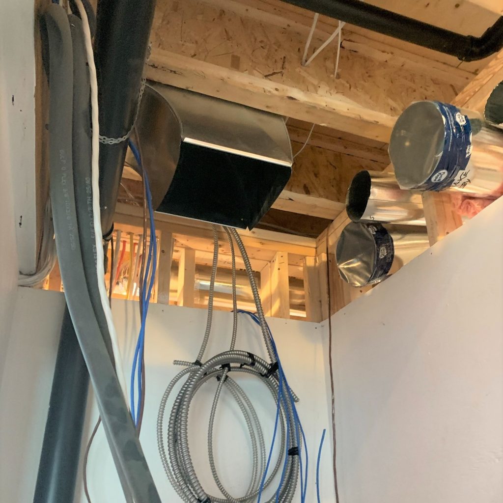
A key goal for our clients was to make the operation of their home as eco-friendly as possible, and that meant going all-electric. There’s a higher capital investment, but the low carbon footprint is in line with their values. An air source heat pump provides both heating and cooling in this house. A Venmar energy recovery ventilator ensures that fresh air is delivered in the most energy efficient way. The house has a fully ducted system. This is tricky to achieve in laneway houses where there are height restrictions, but with careful design, a central mechanical room (between the kitchen and the stairs), and our client’s desire to leave some of the ducts exposed as part of their sophisticated urban aesthetic, we made it all fit! The long-term plan, once finances allow, is to have photovoltaic panels on the south-facing sloping roof. A conduit has been roughed in so that the connection will be relatively easy to do.SystemsGo To Project Page
Our clients wanted a clean, contemporary look that would suit their home’s setting in the heart of Toronto. The result is an eclectic loft aesthetic with a colour palette of crisp white and matte black. White penny tile with black grouting at the entrance. A white faux-brick wall with exposed black ducting in the living room. Whimsical black-and-white rosette tiles in the powder room. Throughout the house, windows framing the CN tower that make the city a piece of art. For the staircase between the second and third stories, which is central to the main living space, the clients splashed out a little, with a glass barrier to make it feel as open as possible, and a waterfall edge to bring sculptural interest. And hey, have we raved about Joël Campbell of Laneway Custom Build yet? Joël Campbell is a builder with great attention to detail. He really cares about the quality of his work, and it shows. The materials used in this project were not overly expensive (e.g. Ikea cabinets, Caesarstone quartz kitchen counter, Olympia porcelain tiles), and thanks to Joël’s masterful work, they have been elevated. From perfectly laid mosaics to flawless reveals, Joël’s meticulous work made this project a success. Two components demanded special attention. The first is the reveal between the kitchen cabinets (Ikea) and the bulkhead in the kitchen (which hides ducting). The second is that waterfall edge on the central staircase. Both are design elements that required meticulous execution and which, if done right, can elevate simple materials into something extraordinary. Hats off to Joël, who nailed it. (Photos of the bathrooms/tilework are by Joël Campbell)InteriorsGo To Project Page
Out of thin air, one Toronto couple has taken the vertical space gifted to them by her parents and created an eco-friendly laneway house that is modern and comfortable. Projects like this are a key part of sustainable house design because they do not create additional footprint. The aesthetic is understated and contemporary, with the occasional splash of whimsy. The black and white palate lets vibrant family life take centre stage. Every square footage of space in this house is used to the greatest possible degree, with a beautiful harmony between practical needs and aspirational design. For example, the short entry hallways on the second floor is narrow to accommodate a closet, and has a low ceiling to accommodate ducting. But this compression results in a lovely feeling of anticipation and makes the living space feel all the more open. A cut-out at the upper stair landing not only brings natural light into the second-floor entrance space but means that guests can be greeted from two different vantage points. As this property goes to show, a Toronto laneway house can also be a sustainable house and a green home. And you don’t even have to disturb the pizza oven.RevealGo To Project Page


- + Intro
- Intro
When housing in Toronto is so expensive, you start to get creative. For one Toronto couple whose parents were willing to share in the creativity, this meant plucking potential out of thin air...
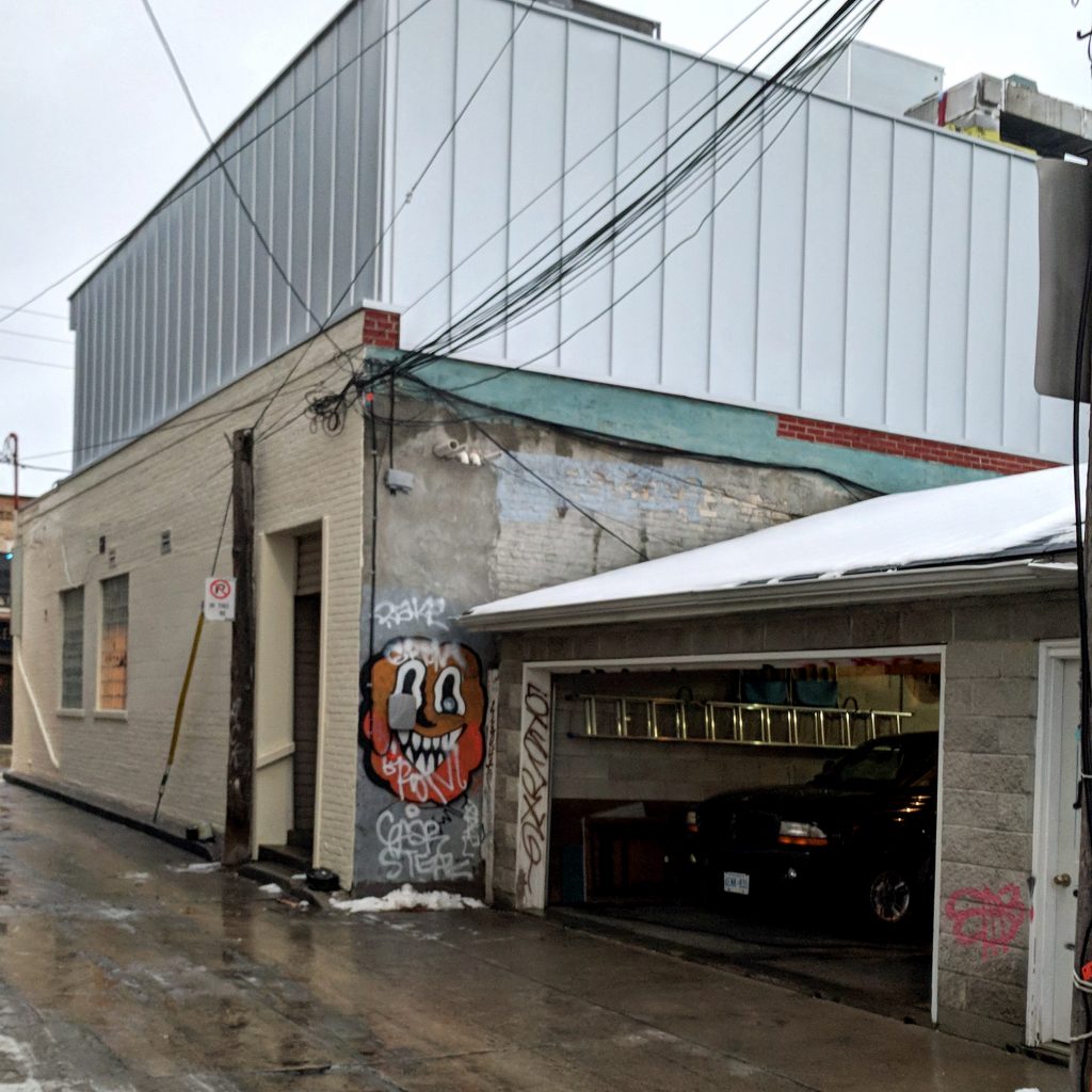
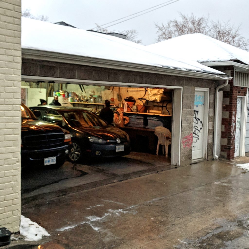
Why not build a house in the empty space above the parents' existing two-car garage?
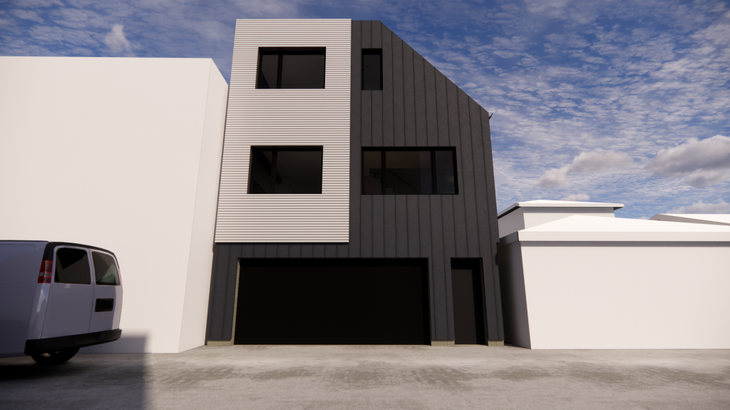
Laneway houses are a new Toronto reality (and they’re the reason we at Solares started our sister website, LNWY). But this project, which began in 2017, pre-dated the bylaw permitting them. Luckily, because the property is right next to Dundas (in the highly desirable Trinity Bellwoods neighbourhood) and was zoned commercial-residential, the owners got special permission to build a laneway house that would rise to three stories in height.
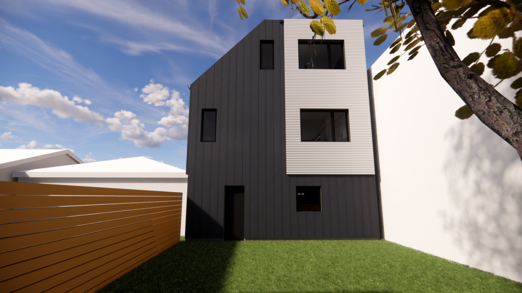
There were rules, of course. For example, the planning committee required the roof to have an angular plane (making it look like a chunk has been severed off the building form). But the strictest rules were from the parents whose generous gift of space was making it all possible. The kids could have the air above the garage, but not the garage itself, which the owners use year-round, including in the summer as a second kitchen for canning and preserves.
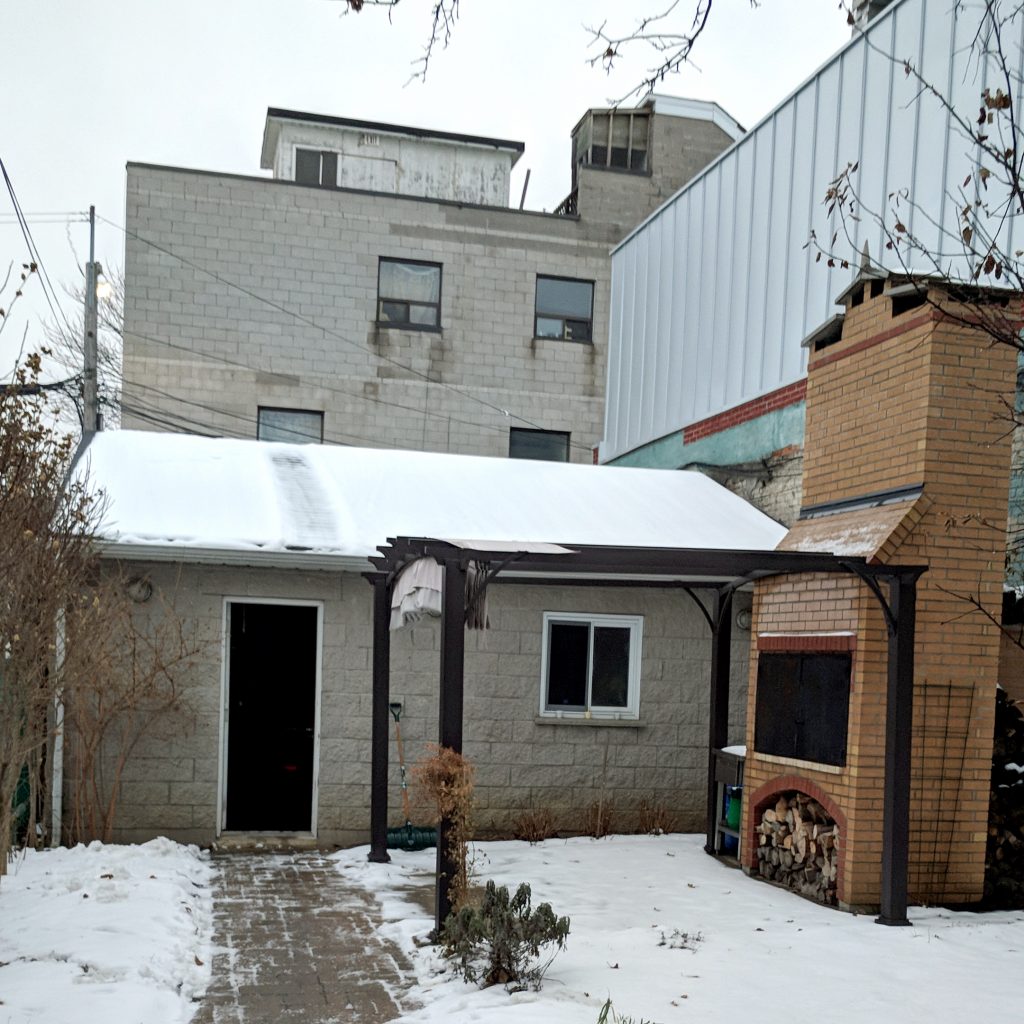
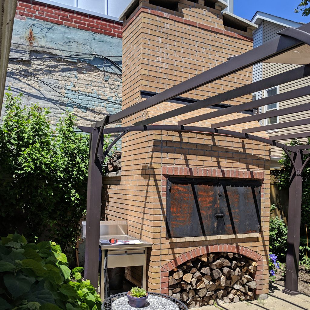
And the beloved outdoor pizza oven—located in the yard between the parents’ house and the garage—was to remain undisturbed. This wonderful family loves their pizza!
Go To Project Page


- + Design
- Design
Two principles informed the design of this visionary project: eco-friendly energy efficiency, and cost. There were also a few "must haves": three bedrooms (the couple plans to have a family) and a private entrance off the laneway.
With just 575 square feet per floor to work with, space efficiency was paramount.
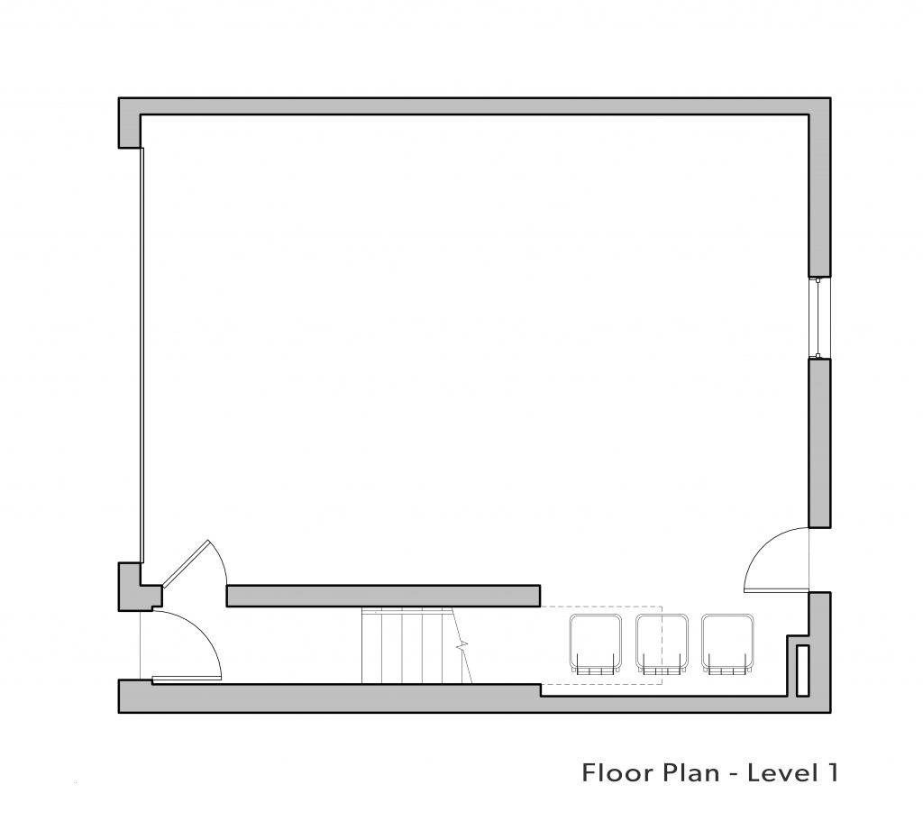
What we designed is essentially a two-story block that fits directly on top of the existing garage.
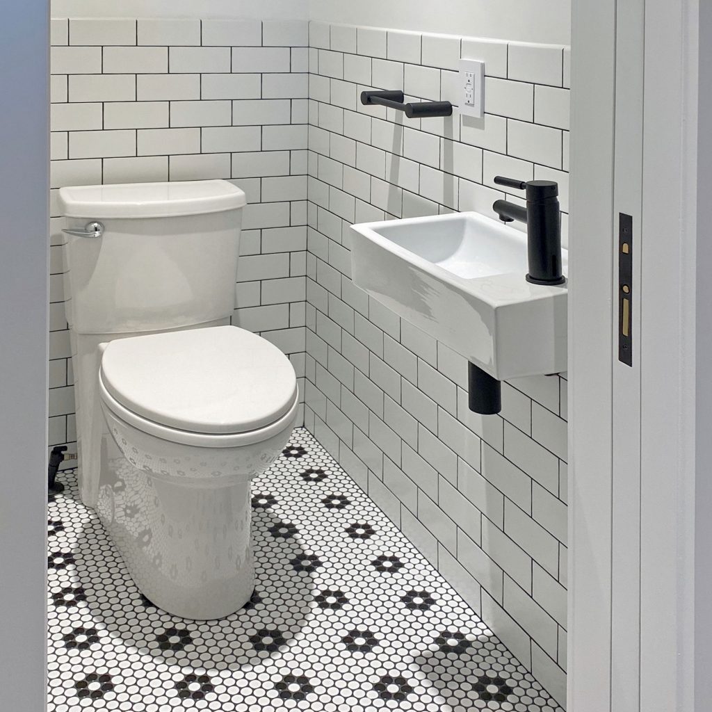
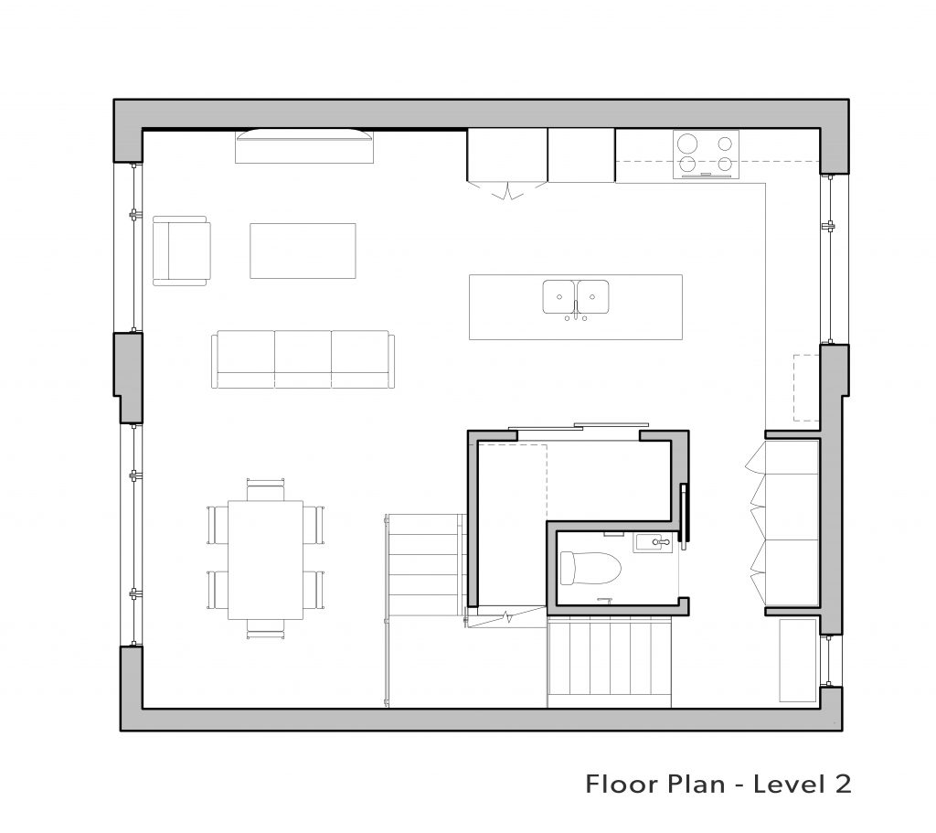
You enter through the existing ground-level door and take a narrow flight of stairs up to a landing on the second floor with a beautiful view of the Toronto skyline. This has a bench, a powder room and a large closet.
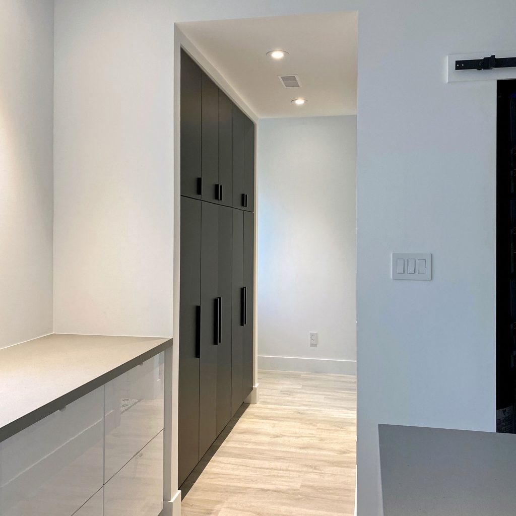
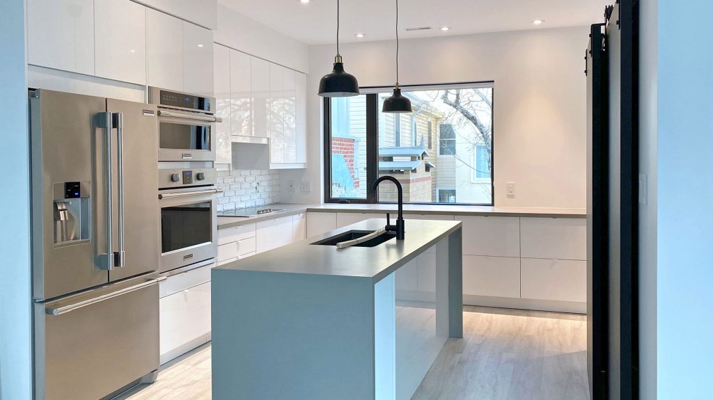
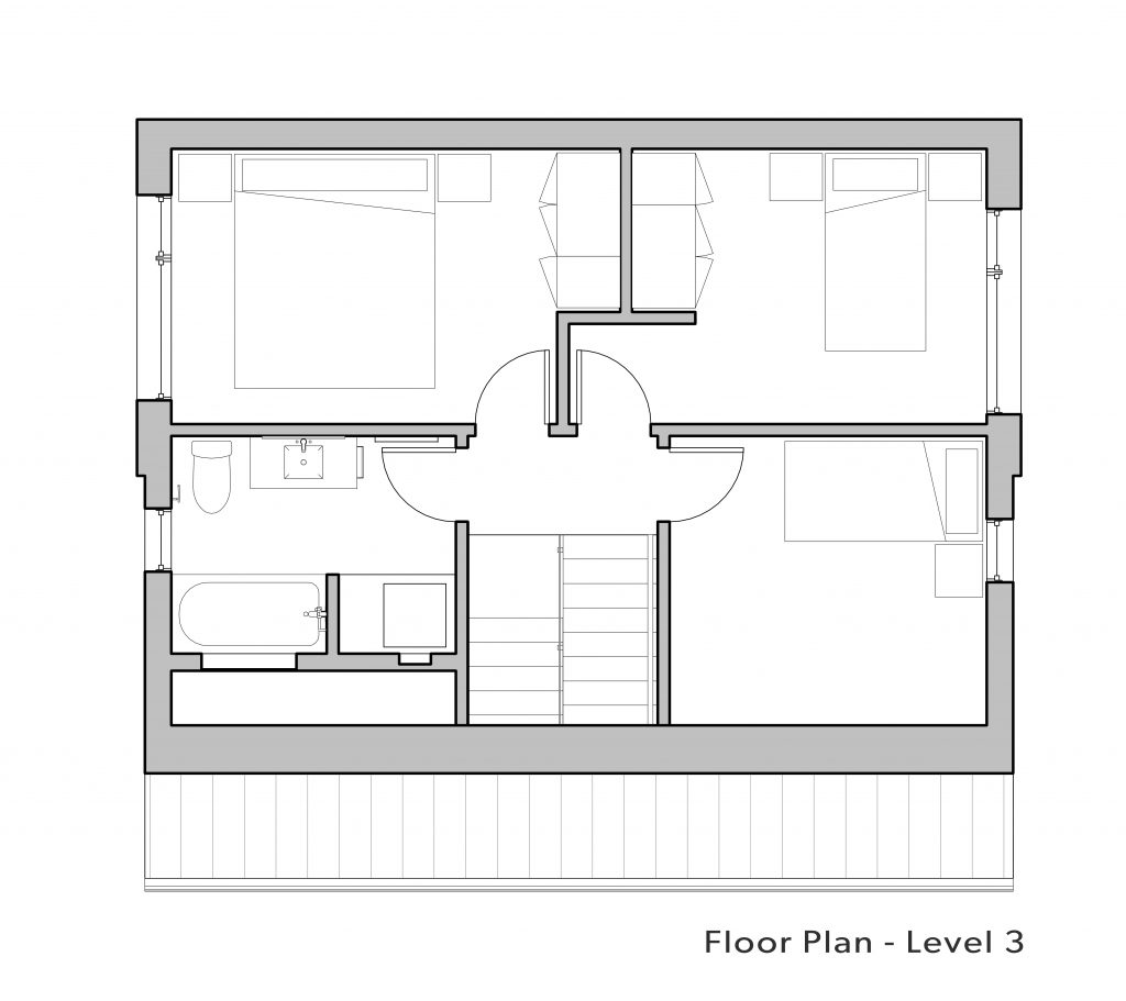
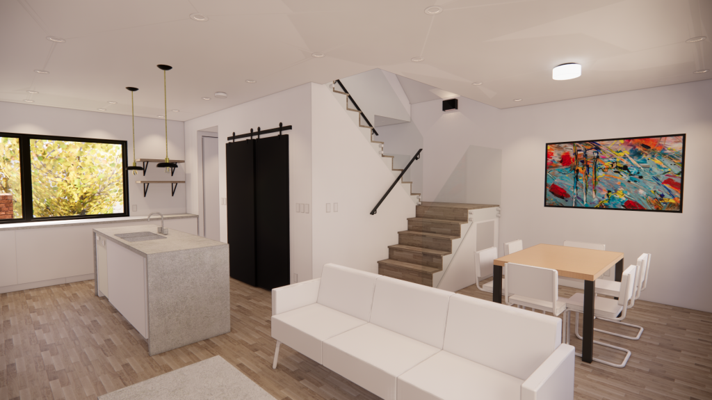
From here, you walk into a large L-shaped space that contains the kitchen, dining space, and lounge area. Mechanicals are tucked under the stairs that lead up to the top floor, which is home to three bedrooms and a communal bathroom.
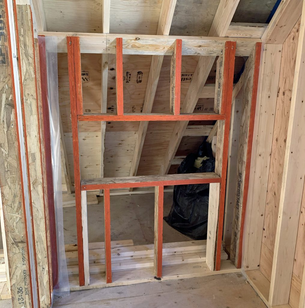
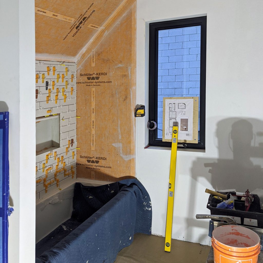
Because of the planning committee's requirement for an angular plane on one side of the building, one of the bedrooms and the bathroom have a sloping roof.
Originally, there were plans for a rooftop deck but, despite having permission to build this, budgetary restraints dictated that it be cut from the project.
The beautifully proportioned rooms, smart design choices, and flawless finishings (which we'll get to in the "Interiors" section!) make this small house feel like a perfect fit.
Go To Project Page
- + Structure
- Structure
We raised the roof on this project. Literally.
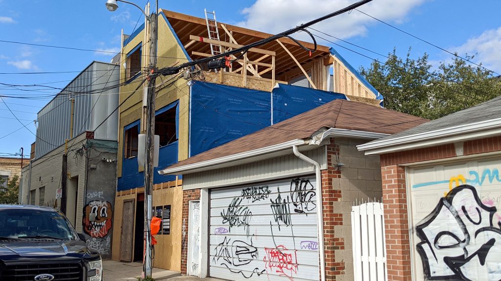
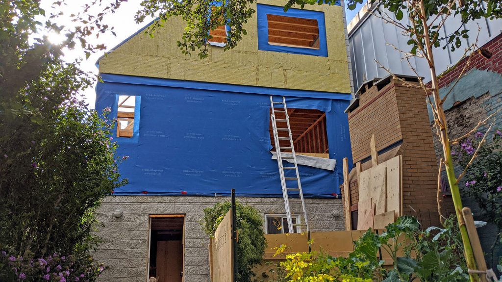
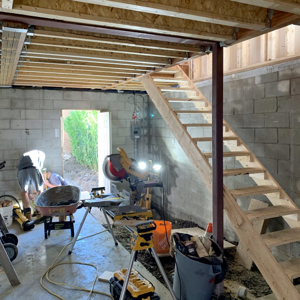
Once that was gone, we set out framing the new structure. We had to replace the garage’s drop beam with a steel beam and add a steel moment frame at the front. But because steel is an expensive, carbon-intensive material, we used more eco-friendly wood and engineered wood framing everywhere else that we could.
The wall along the property line was built from concrete blocks. The other three walls were framed in a 2”x 6” stud.
Construction was done by the inimitable Joël Campbell of Laneway Custom Build, and he knocked our socks off with the quality and thoughtfulness of his work. Here’s an example: even though it wasn’t in the spec, Joël chose to use laminated veneer lumber (LVL) rather than regular dimension lumber when he framed the walls of the shower in the upstairs bathroom and the walls on which cabinets were hung in the kitchen. Why? Because LVL ensures the most true walls possible, which makes tiling and hanging cabinets a cinch.
Go To Project Page


- + Envelope
- Envelope
As you’ll know if you’ve read any of our projects, we at Solares love to insulate. Given the extremes of heat and cold that we get in Canada, it’s a no-brainer for energy efficiency. If you want a greener home, start with improved insulation (then see below re: air tightness!).
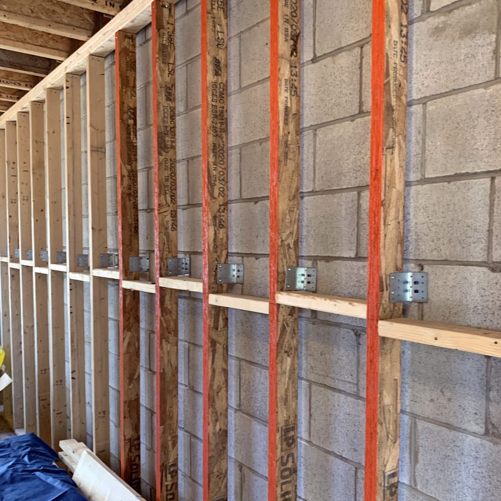
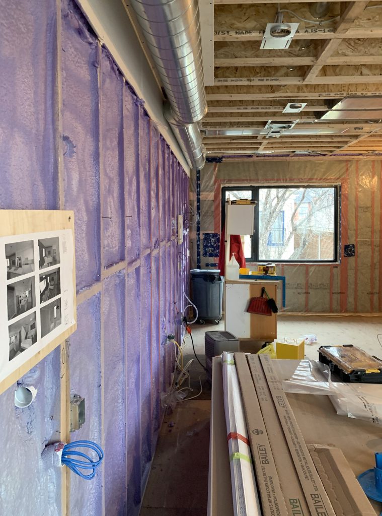
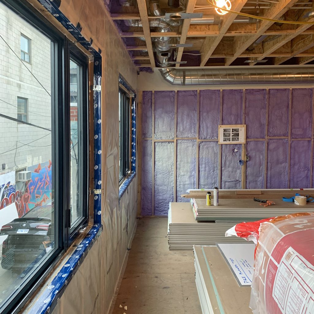
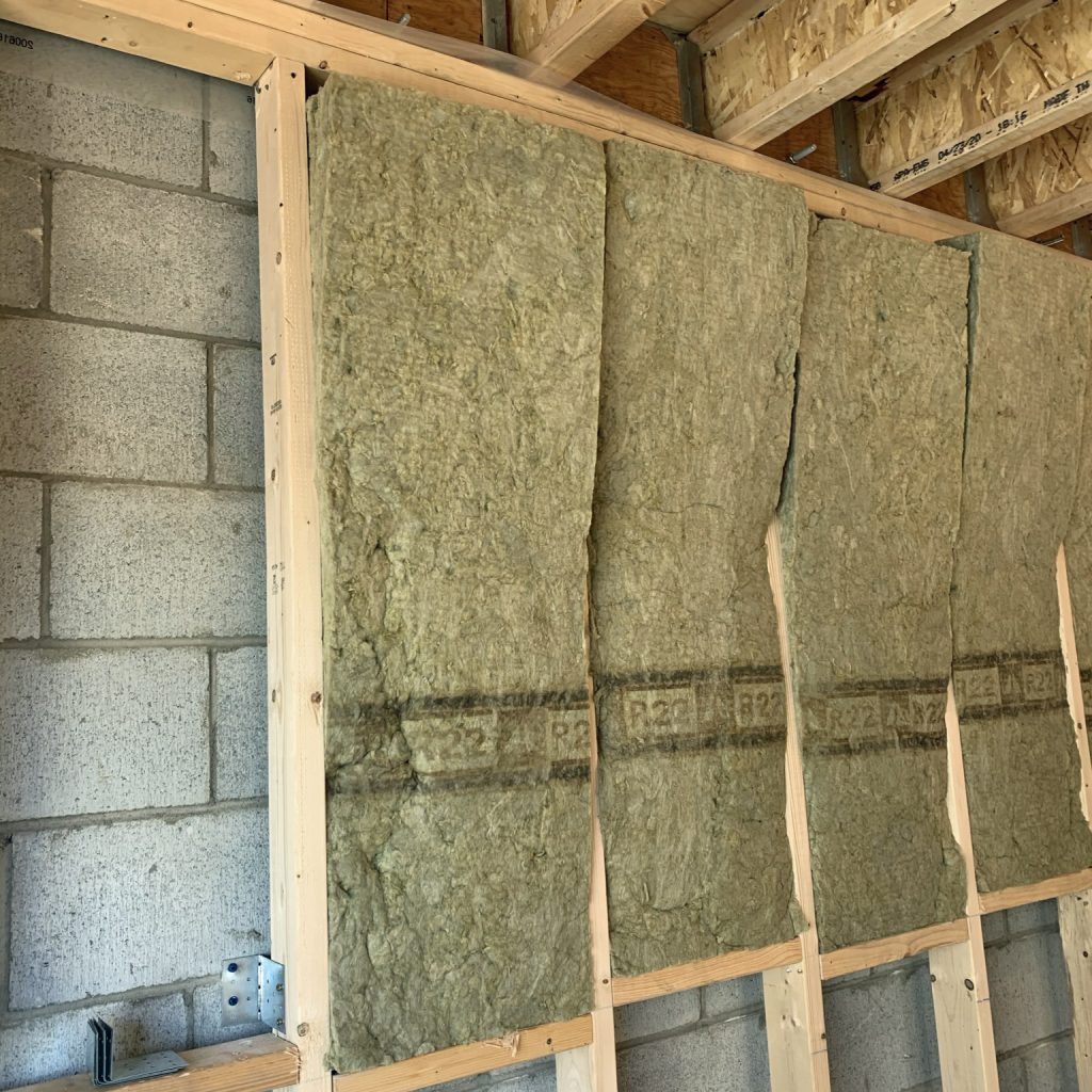
We insulated the interior of the concrete-block walls by furring them out and using high-performance spray foam insulation. For the wood-frame walls, we placed mineral wool batts between the 2"x 6" studs, then a vapour barrier, then drywall.
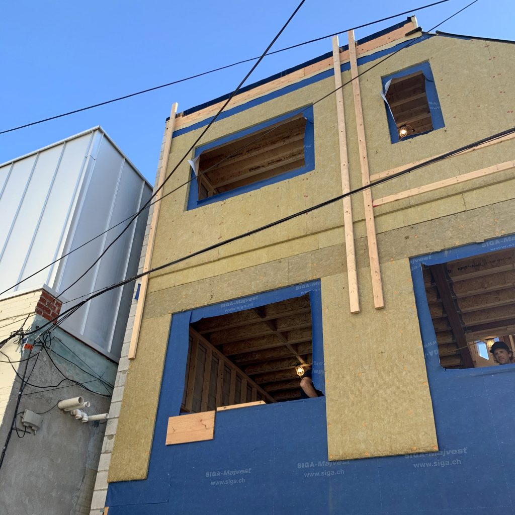
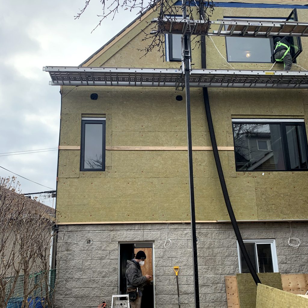
We insulated the outside of the building (yes, the outside) with Rockwool ComfortBoard. This mineral product is less carbon-intensive than the alternatives and offers great soundproofing, which is always nice in the city. We added strapping to all four walls in order to hang the corrugated steel cladding.
Corrugated steel cladding is cheap, durable, and if designed well and installed properly it can look very sophisticated. We sourced ours from VicWest. The Eurovinyl windows are triple-glazed with an Unplasticized Polyvinyl Chloride (UPVC) frame and have a very good energy-efficiency performance.
None of the building materials we used were flashy or expensive—they were all off-the-shelf! But they were used well. If care is taken to get a really tight seal with the building envelope, a very high level of energy efficiency can be achieved.
We got this project super airtight, thanks to the meticulous attention to detail by builder Joël Campbell of Laneway Custom Build. Also, we had the assistance of Justin Hamway of Siga, who came to the site and worked with Joël to make the air barrier as tight as possible using Siga tapes. In the end, the pre-drywall air tightness test for this building was almost at passive house value.
That’s a really tight envelope!
Go To Project Page


- + Systems
- Systems
A key goal for our clients was to make the operation of their home as eco-friendly as possible, and that meant going all-electric. There’s a higher capital investment, but the low carbon footprint is in line with their values.
An air source heat pump provides both heating and cooling in this house. A Venmar energy recovery ventilator ensures that fresh air is delivered in the most energy efficient way.
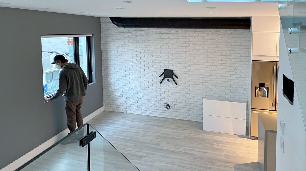
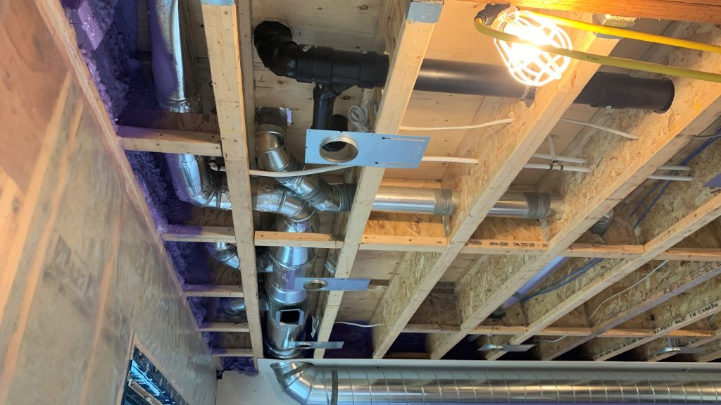
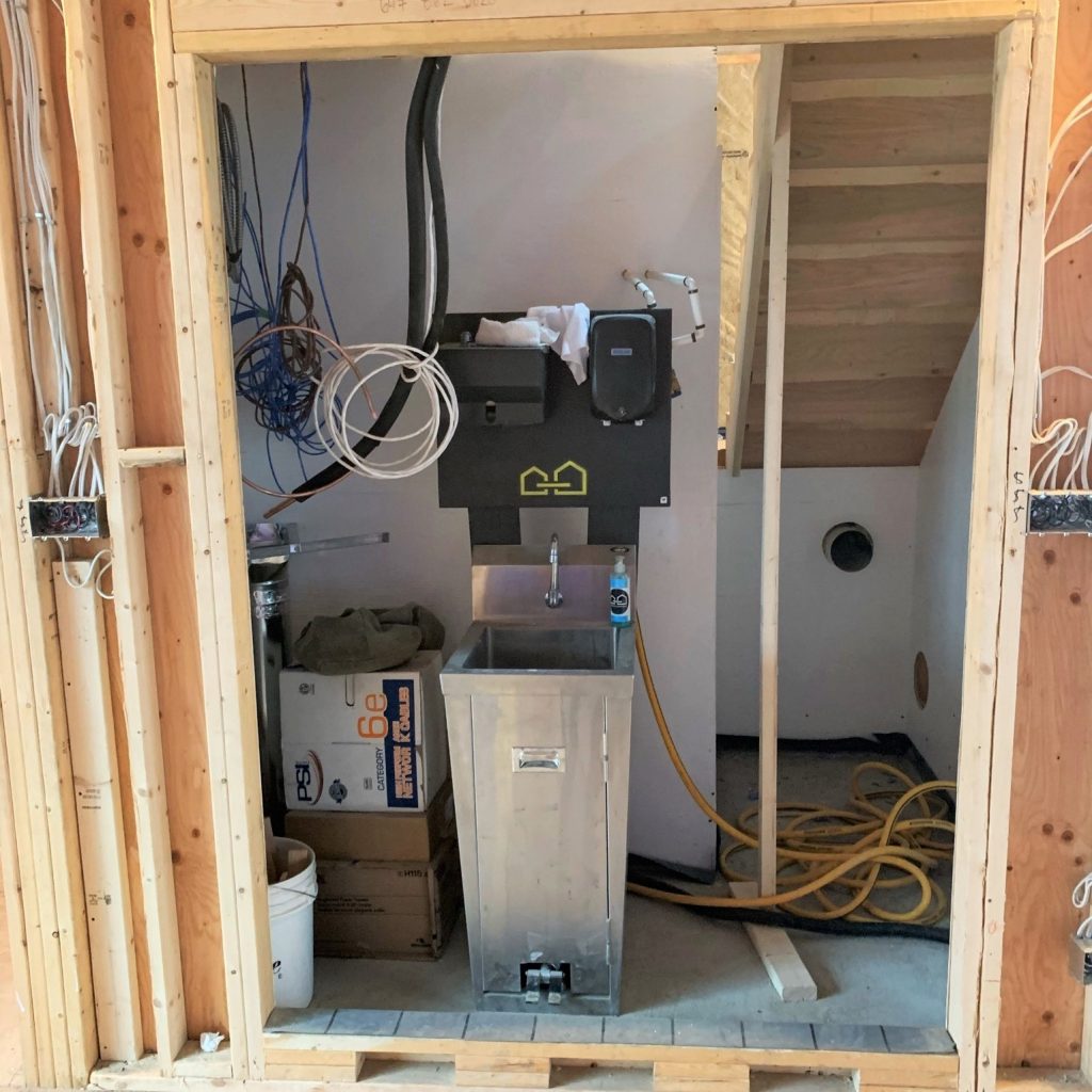
The house has a fully ducted system. This is tricky to achieve in laneway houses where there are height restrictions, but with careful design, a central mechanical room (between the kitchen and the stairs), and our client’s desire to leave some of the ducts exposed as part of their sophisticated urban aesthetic, we made it all fit!
The long-term plan, once finances allow, is to have photovoltaic panels on the south-facing sloping roof. A conduit has been roughed in so that the connection will be relatively easy to do.
Go To Project Page


- + Interiors
- Interiors
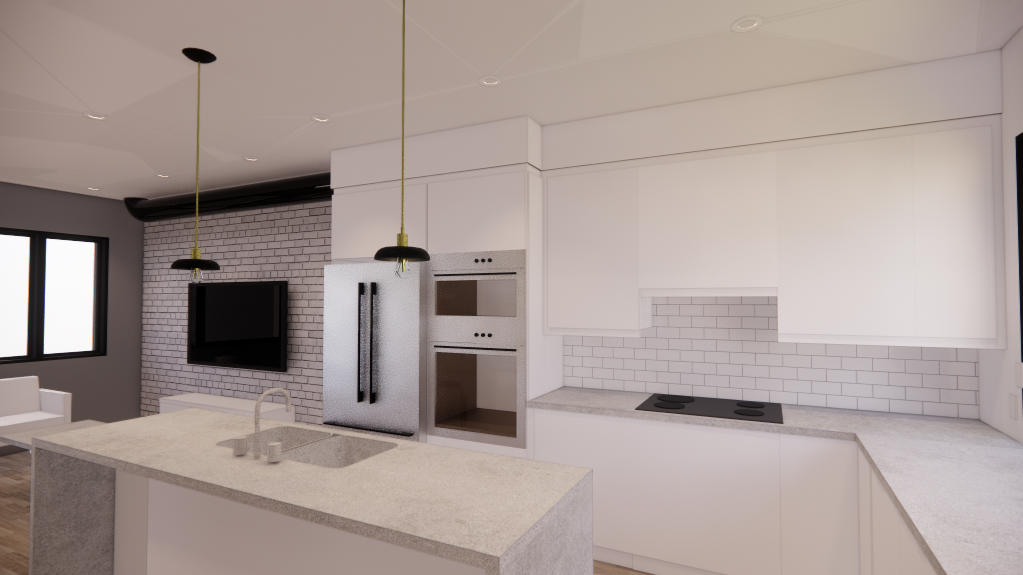
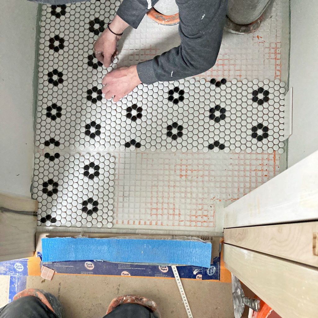
Our clients wanted a clean, contemporary look that would suit their home’s setting in the heart of Toronto. The result is an eclectic loft aesthetic with a colour palette of crisp white and matte black. White penny tile with black grouting at the entrance. A white faux-brick wall with exposed black ducting in the living room. Whimsical black-and-white rosette tiles in the powder room.
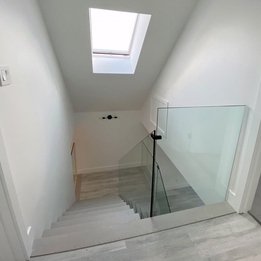
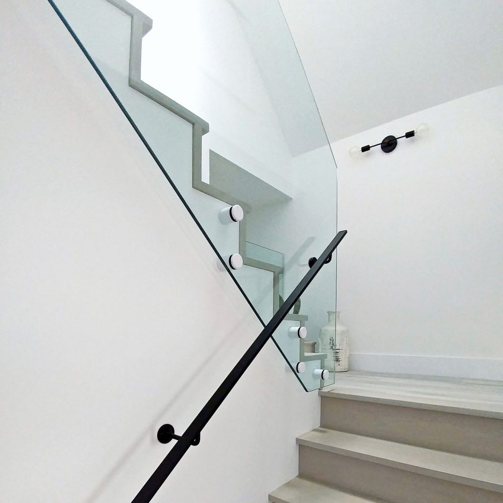
Throughout the house, windows framing the CN tower that make the city a piece of art. For the staircase between the second and third stories, which is central to the main living space, the clients splashed out a little, with a glass barrier to make it feel as open as possible, and a waterfall edge to bring sculptural interest.
And hey, have we raved about Joël Campbell of Laneway Custom Build yet?
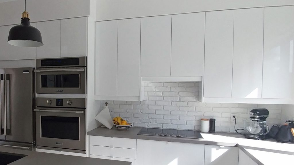
Joël Campbell is a builder with great attention to detail. He really cares about the quality of his work, and it shows. The materials used in this project were not overly expensive (e.g. Ikea cabinets, Caesarstone quartz kitchen counter, Olympia porcelain tiles), and thanks to Joël’s masterful work, they have been elevated. From perfectly laid mosaics to flawless reveals, Joël’s meticulous work made this project a success.
Two components demanded special attention. The first is the reveal between the kitchen cabinets (Ikea) and the bulkhead in the kitchen (which hides ducting). The second is that waterfall edge on the central staircase. Both are design elements that required meticulous execution and which, if done right, can elevate simple materials into something extraordinary.
Hats off to Joël, who nailed it.
(Photos of the bathrooms/tilework are by Joël Campbell)
Go To Project Page


- + Reveal
- Reveal
Out of thin air, one Toronto couple has taken the vertical space gifted to them by her parents and created an eco-friendly laneway house that is modern and comfortable. Projects like this are a key part of sustainable house design because they do not create additional footprint.
The aesthetic is understated and contemporary, with the occasional splash of whimsy. The black and white palate lets vibrant family life take centre stage.
Every square footage of space in this house is used to the greatest possible degree, with a beautiful harmony between practical needs and aspirational design. For example, the short entry hallways on the second floor is narrow to accommodate a closet, and has a low ceiling to accommodate ducting. But this compression results in a lovely feeling of anticipation and makes the living space feel all the more open. A cut-out at the upper stair landing not only brings natural light into the second-floor entrance space but means that guests can be greeted from two different vantage points.
As this property goes to show, a Toronto laneway house can also be a sustainable house and a green home.
And you don’t even have to disturb the pizza oven.
Go To Project Page
